
Data Input Models!

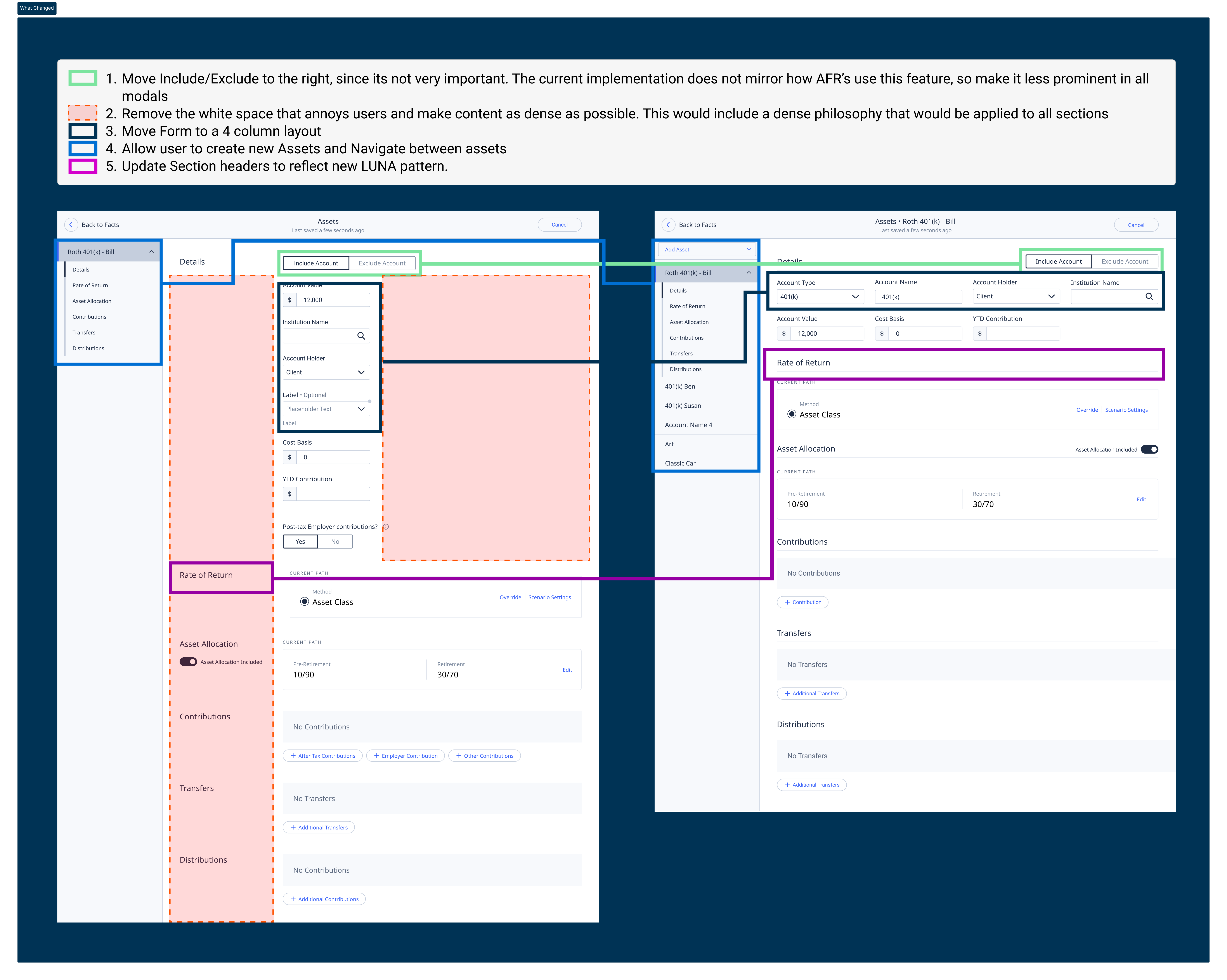
Problem Users struggled with form completion because the data entry experience was fragmented, dense, and lacked consistency across different modal sections.
Solution
Redesign core data input modals with improved density,
clearer information architecture, and a unified Figma workflow to create a seamless, consistent
user experience across PX.
My Role: Senior UX Designer
Completed 2023
Number of users: 2,700
Team size: 1 Sr UX. Designer, 1 Junior UX Designer
What is PX?
PX forms the bedrock of our Planning Experience web app, enabling the Field Office to embark on the planning journey with clients. The Data Input Modals act as the gateway, where users input vital client data into PX, molding intricate plans and dispensing financial advice. Our pursuit involved a deep exploration into untangling and addressing the core challenges users encountered during the data entry process within PX.
Discovery
Using HEAP I worked with a PM to get an idea of how many assets were added to an account and how many accounts an AFR (our power user) were adding on average per account. This would give us a good idea of what type users and workflows involved.
Feedback from our users
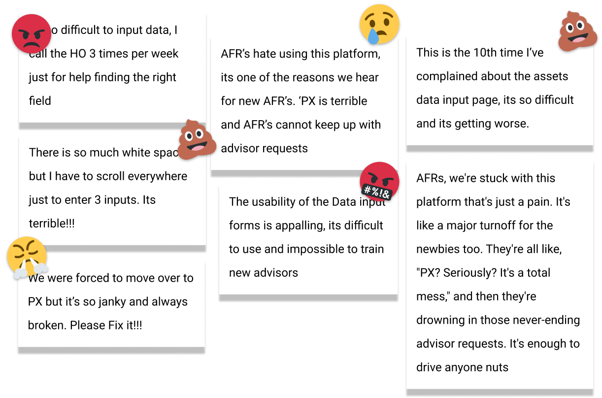
We had a chance to sit down with a few of our major power users, and they gave us some valuable insights into the current experience and the most common pain points.
User Interviews
We had a chance to sit down with a few of our major power users, and they gave us some valuable insights into the current experience and the most common pain points.
Forms Workshop
To learn more about the current state of forms I ran a workshop where I covered some simple principles and design strategies. Gaining alignment from Product on the direction of the forms. So that when we start reviewing designs Product has much more context for what a 'Best in Class' data input experience looked like
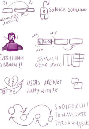
Current State of the Forms
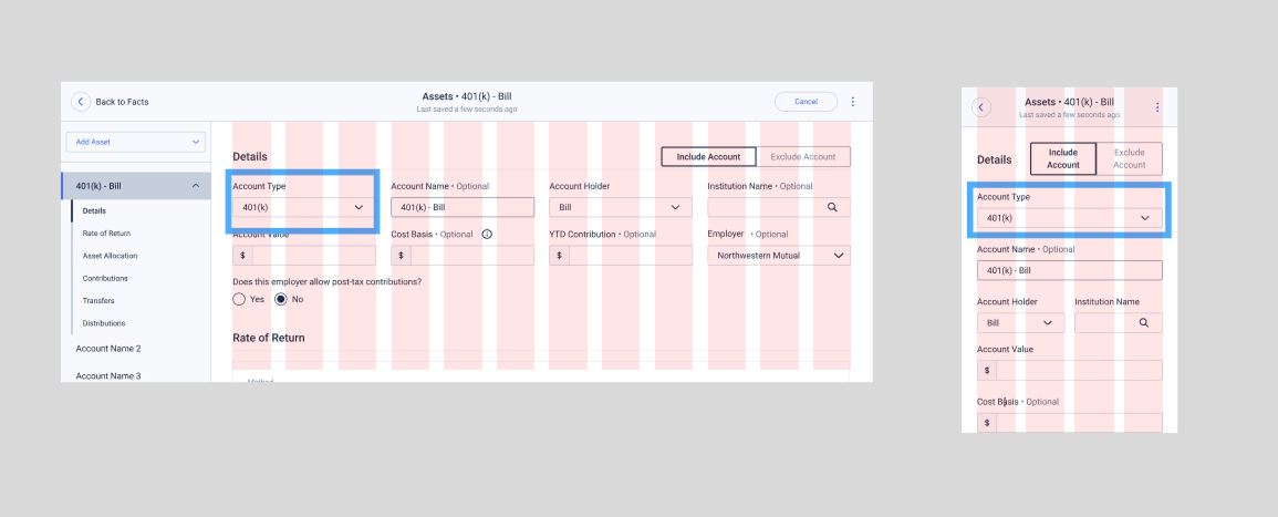
Assessment: Evaluated Lenovo laptop form in the field, uncovering issues. Clear Focus: On the data entry page, we saw the need for improvements, prompting a wider view of enhancements. Comprehensive Refinements: This insight drove targeted improvements across the interface for a smoother user experience.
Simple improvements
By suggesting simple improvements to the existing forms, we were able to quickly improve the user experience without needing to invest in a full redesign. These improvements included:
- Improved form density and spacing
- Clearer labeling and instructions
- Better visual hierarchy
- Consistent field styling
- Enhanced error messaging
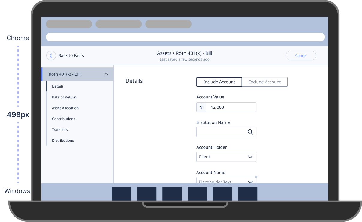
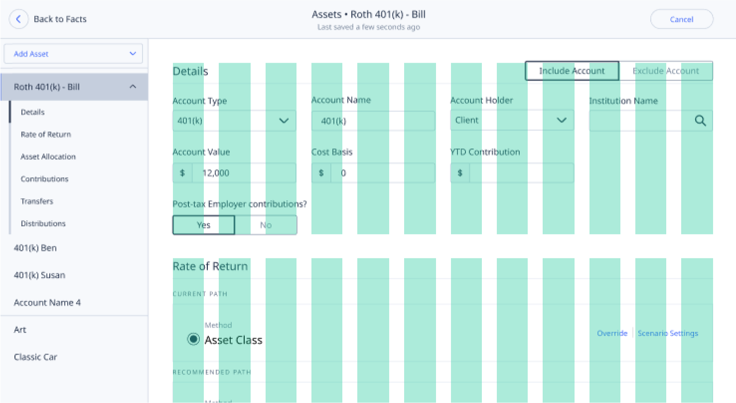
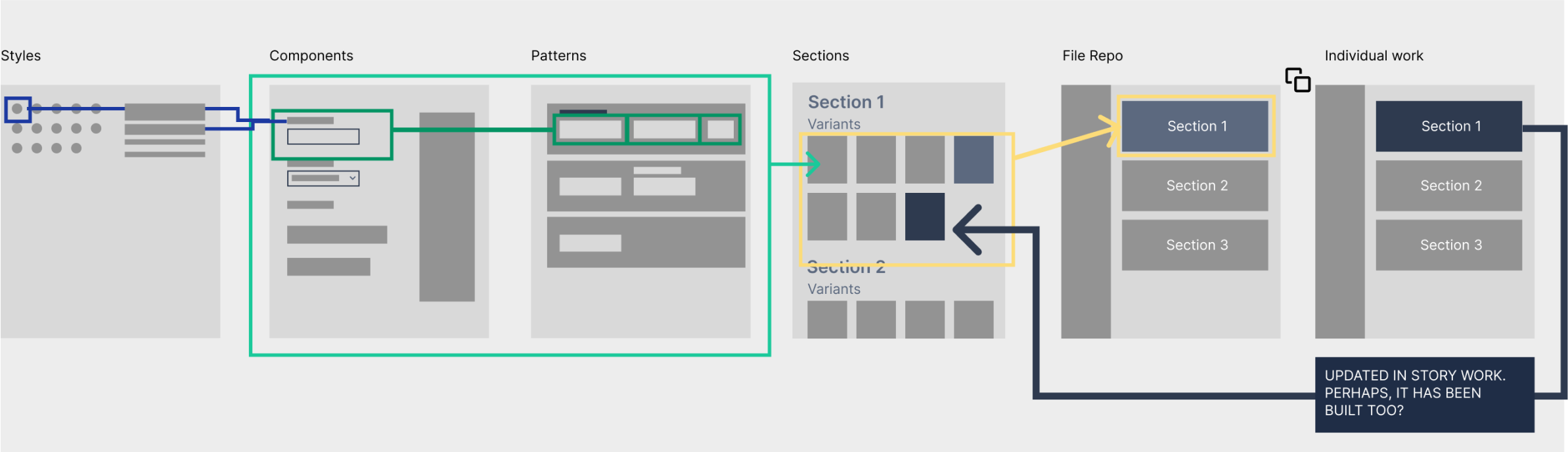
Grids First
Guided by these insights, we utilized the Bootstrap Grid as a framework to design improved, denser, and consistent forms. Collaborative feedback with the Product Team and designers refined the forms further. Importantly, this adaptable pattern offers a scalable solution for other input forms and serves as the foundation for achieving responsiveness throughout PX.
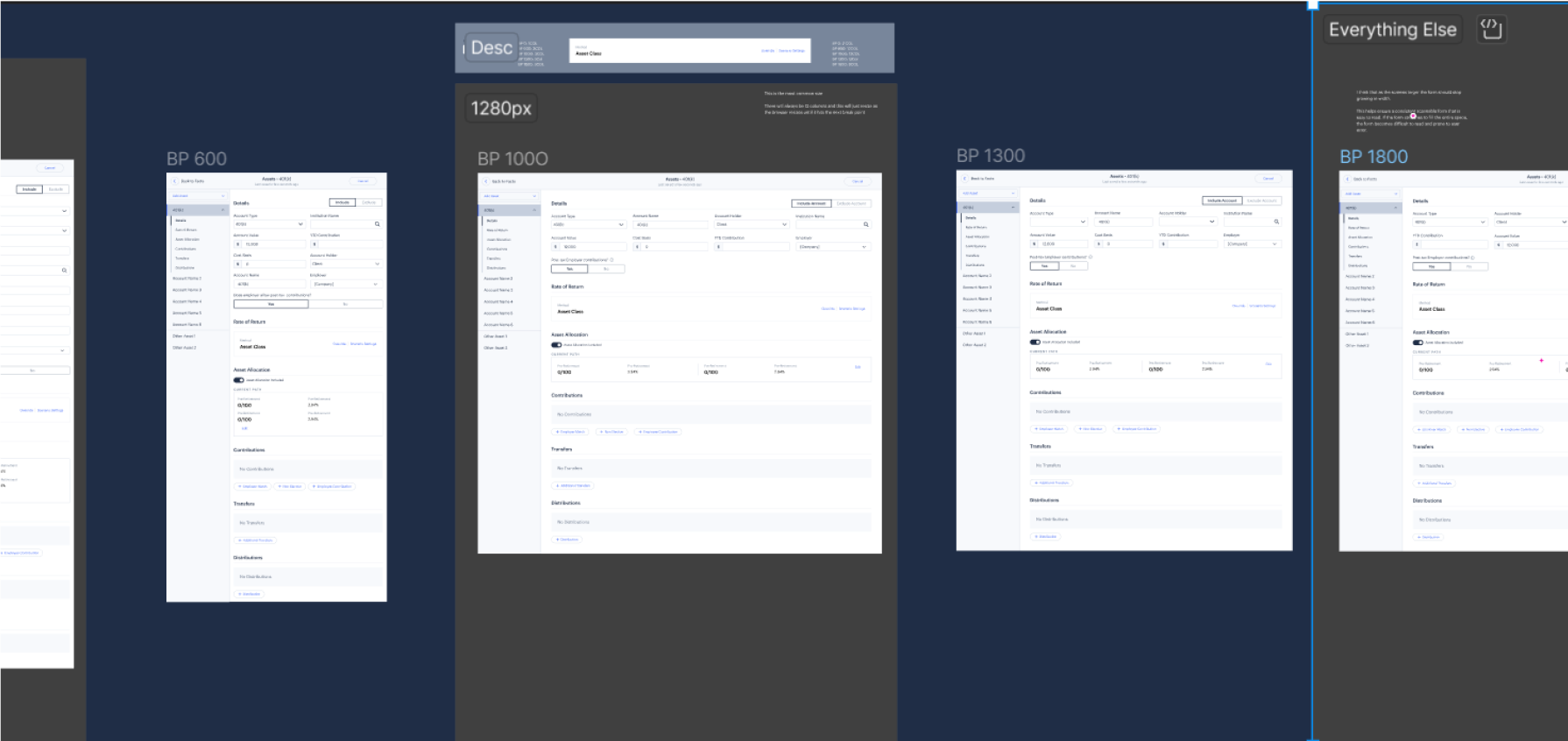
Responsiveness
Using the grids made it much easier to implement responsive designs. I created designs for the 2 main breakpoints in our design system, so that developers could easily reference these when implementing the new forms.
Other use cases
Subsequently, I rounded out the assets page by developing the remaining screens, providing developers with pixel perfect designs for execution. Leveraging Bootstrap Grids, we transformed these insights into specifications for the 5 available Breakpoints within our design system. This streamlined the process for developers to adopt and implement the responsive new forms. Utilizing Figma's Collections feature, we crafted dynamic prototypes that effectively illustrated the functionality of these pages.
Next Steps
Having successfully modernized the Assets Modal, the next phase involved its application to other sections. A substantial effort of creating 51 screens was undertaken, encompassing Liabilities, Insurances, and Incomes. While these sections might be less frequently used, this endeavor ensures a unified and consistent user experience throughout PX. By establishing this uniformity, form enhancements cascade across the platform, elevating the quality of forms across various sections and contributing to an improved user experience.
The product team were ready to move on to other stories, so I took the intitiative and enlisted UXR to create a 'Baseline' for this very simple flow. How long it takes on average for a user to add 1, 3 and 5 assets using the same input data. Heap data wasn't able to get this level granularity but with the help of 3 of our Field Partners we just literally timed them doing this. This was averaged and tidied up, where we removed null data and a helpful baseline was established and then compared to the same users using the same modal but with the updated Interface.
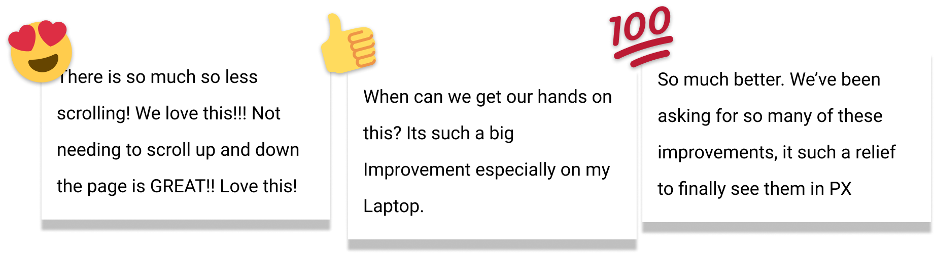
User Feedback
During this round of Research, the participants we were 'timing' were also giving alot of positive feedback that made the team feel great about these improvements.
Final Thoughts
While not glamorous, this effort significantly enhances user experience, elevating the app to 'Best in Class' status. It laid a strong foundation for a Figma library that supports designers and doesn't merely duplicate the design system. Leadership recognized its value, attributing an uptick in user sentiment among AFRs to this work in a subsequent user survey.