
Company: NorthWestern Mutual
My Role: Senior UX Designer
Completed 2023
Number of users: 2,700
Team size: 1 Sr UX. Designer

Our mission: to fix one of the most broken and unusable parts of PX. This challenge was no ordinary task; it involved decoding intricate user experience puzzles, navigating organizational hurdles, and, ultimately, transforming user sentiment even on just a small flow.

Our users faced a daunting problem - every plan comprised 8-10 assets each with 10-150 holdings/allocations, a time-consuming ordeal that sapped their productivity. By 2021, our inbox was flooded with approximately 6,000 complaints specific to this issue. The situation was compounded by a declining System Usability Scale (SUS) score, witnessing a 33-point drop in just two years, reflecting the low user sentiment. Users felt abandoned, losing trust in the PX platform. Most users had resorted to manual methods, using the PX platform solely for presentation purposes. This feature was just a symptom of the wider problem: users hated PX, and their complaints had been ignored for over 8 years.
Problem Statement
As we delved deeper into the user experience, it became evident that this user issue was only the tip of the iceberg. The decline in the SUS score was not an isolated incident. Northwestern Mutual had allowed a culture of stagnant design and unresolved user complaints to fester for years, leaving dozens of equally broken unusable flows.
Undeterred, we embarked on a quest to salvage this section and create a low-effort solution that could be easily fit into 1-2 sprints. But it wasn't just about fixing a single feature; it was about restoring faith and rebuilding trust, one feature at a time.
User Journey Map
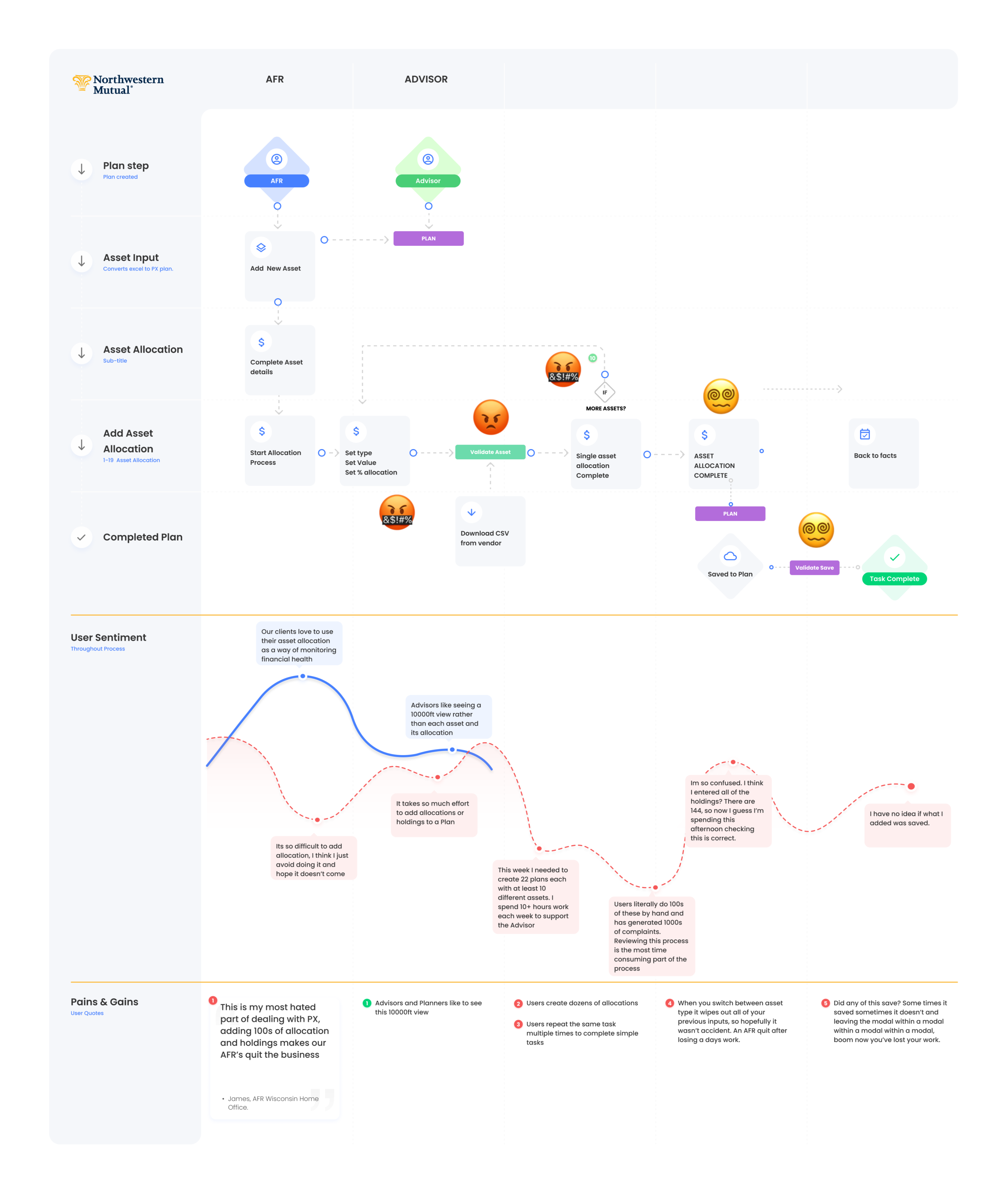
We had a chance to sit down with a couple of our power users who were 'Evangelists' for the PX platform, they were very forward with their opinions of how adding assets and holdings to a plan currently worked, I used these insights to map out the current experience including pain points.
Persona Synthesis
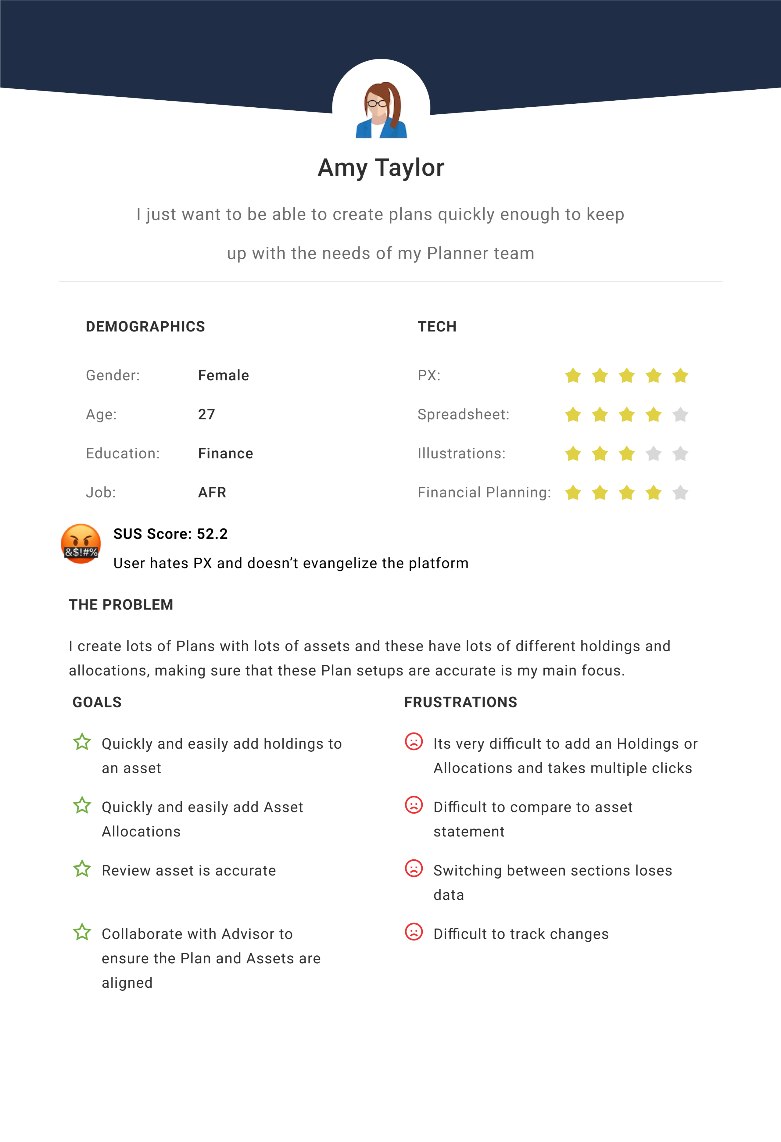
The current personas did not include any of our power users, so detailing these out even roughly just for this effort would help us build empathy.
Empathy Map
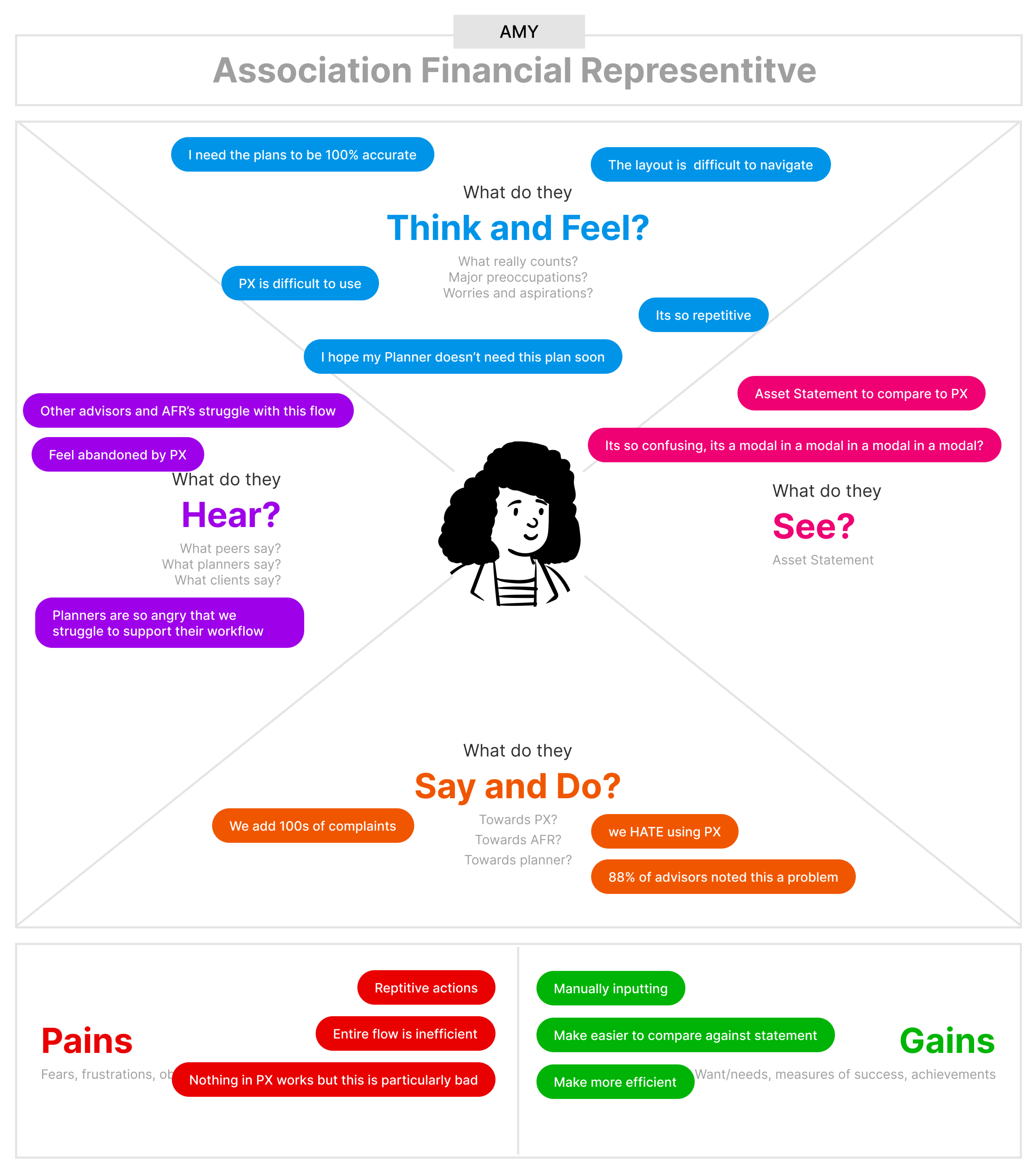
I synthesised some of these conversations into an empathy map so that it could be more easily digested.
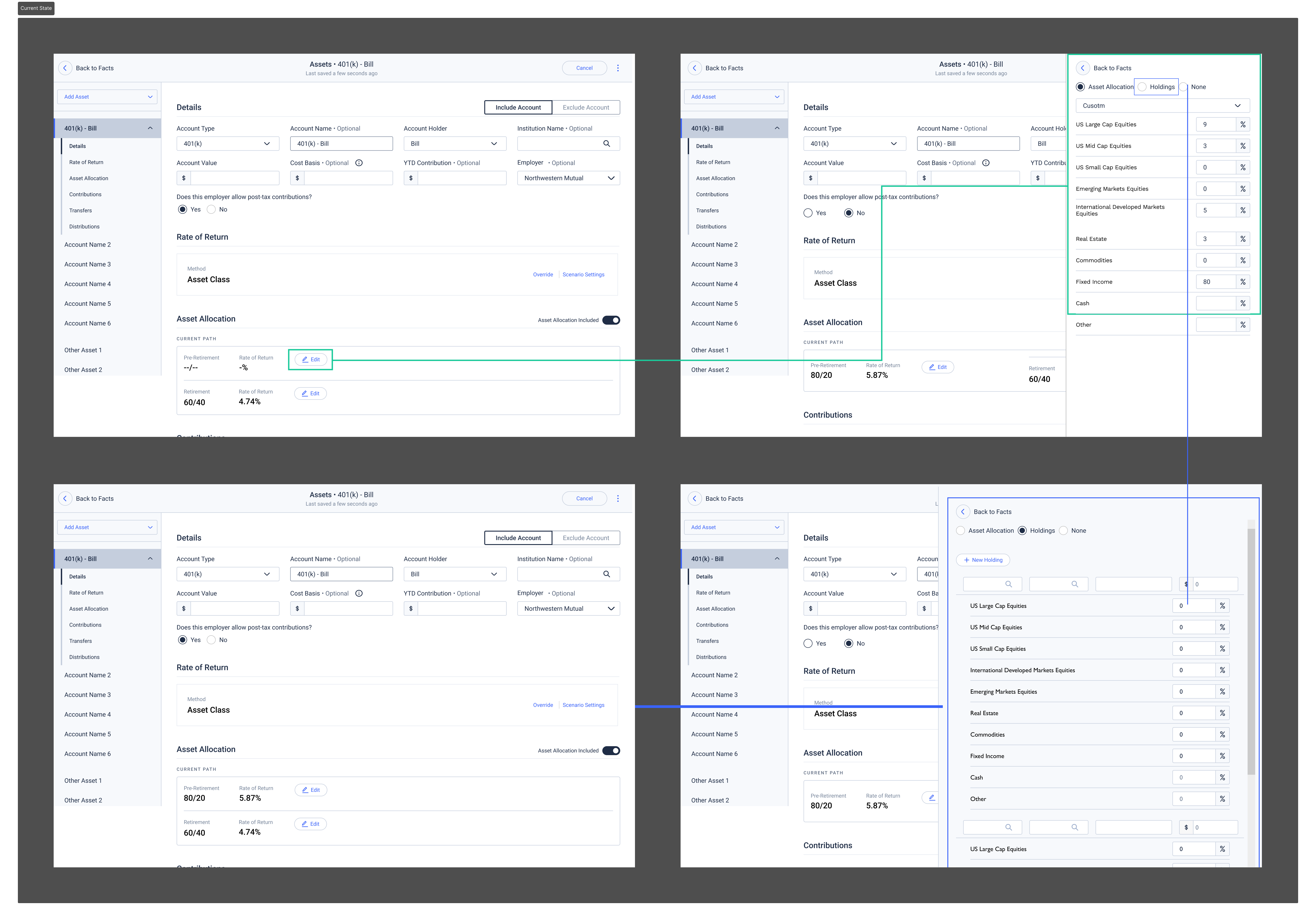
Current State of the Asset Allocation flow
Working with product partners we started looking more closely at the current state user previous insights.
Medium Fidelity Propotype
With enhanced designs and a refined information architecture, I partnered closely with the Product Manager to create these solutions. We leveraged our monthly sessions with field members who highlighted issues with the page. Under the guidance of the User Experience Research (UXR) Lead, users were directed to add same 3 assets and then make a small edit. This approach aligns with the typical user workflow for adding client assets.

The feedback was overwhelmingly positive and validated many of our initial findings. This was a huge improvement to the current experiencel we also got a lot of helpful information about what could be a post MVP feature. When we showed this prototype to users, they spoke of how useful it would be to have an import/export feature, so that this feature could replace other workflows too.
The product team were ready to move on to other stories, so I took the intitiative and enlisted UXR to create a ‘Baseline’ for this very simple flow. How long it takes on average for a user to add 1, 3 and 5 assets using the same input data. Heap data wasn’t able to get this level granularity but with the help of 3 of our Field Partners we just literally timed them doing this. This was averaged and tidied up, where we removed null data and a helpful baseline was established and then compared to the same users using the same modal but with the updated Interface.
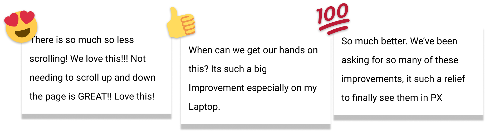
User Feedback
During this round of Research, the participants we were ‘timing’ were also giving alot of positive feedback that made the team feel great about these improvements.
Final Thoughts
Creating a low-effort fix to one of the most common tasks had an out-sized impact on users lives, more importantly it showed that design and product could work together to create real improvements, rather than the fractious relationships that preceeded me. It showed users that we were listening and that there opinions and feedback were being heard. The improved SUS score and improved user sentiment validated that this small effort was worth it and how just listening to the user yielded improved experience. Unfortunately, design leadership was more interested in a complete rewrite rather than fix these severely broken features and flows.