
Company: NorthWestern Mutual
My Role: Senior UX Designer
Completed 2023
Number of users: 3-20 Designers
Team size: 1 Sr UX. Designer
The Problem
Designers used the central design system for all design tasks. However, LUNA presented a complexity issue with hundreds of components and numerous variants. This complexity led to designer confusion regarding component selection, to the extent that designers often needed to become experts in the system just to initiate their work.
Adding to the complexity, design managers held their own specific philosophies on how to best leverage the design system. These varying philosophies further complicated matters, as designers were expected to align their work not only with the design system but also with the specific preferences of their respective managers.
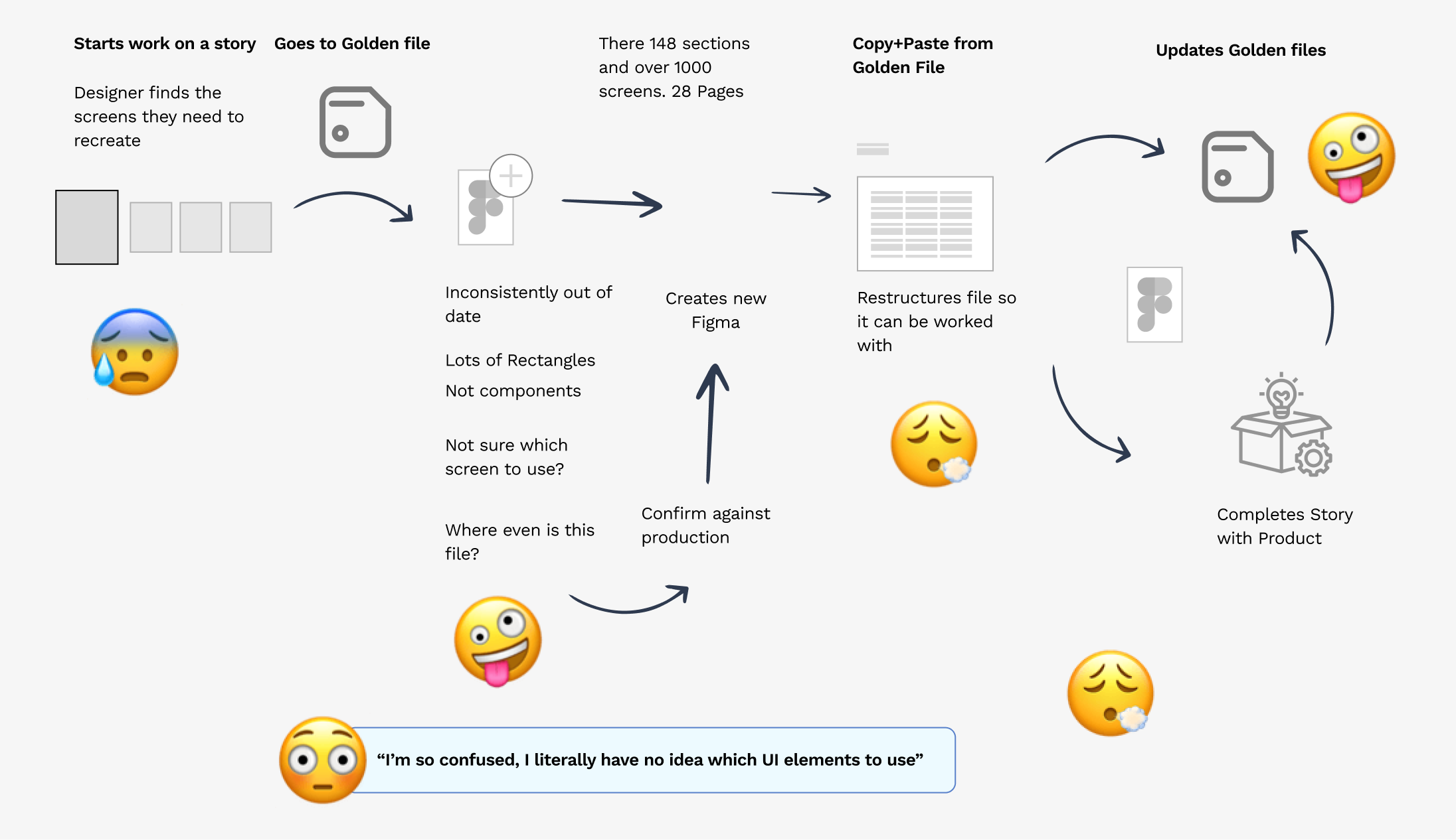
While 'Golden Files' existed, they consisted of artboards with grouped components, often impractical for many projects and requiring extensive setup before actual design work could commence. The consequence was a proliferation of inconsistent designs, compromised design quality, and challenging implementation processes. Designers found themselves grappling not only with the demands of their projects but also with mastering a complex design system, all while accommodating differing managerial philosophies. This multifaceted challenge hindered efficiency and the overall design process.
The Solution
Create a design toolkit that provides makes creating design work easier.
Understanding the current process
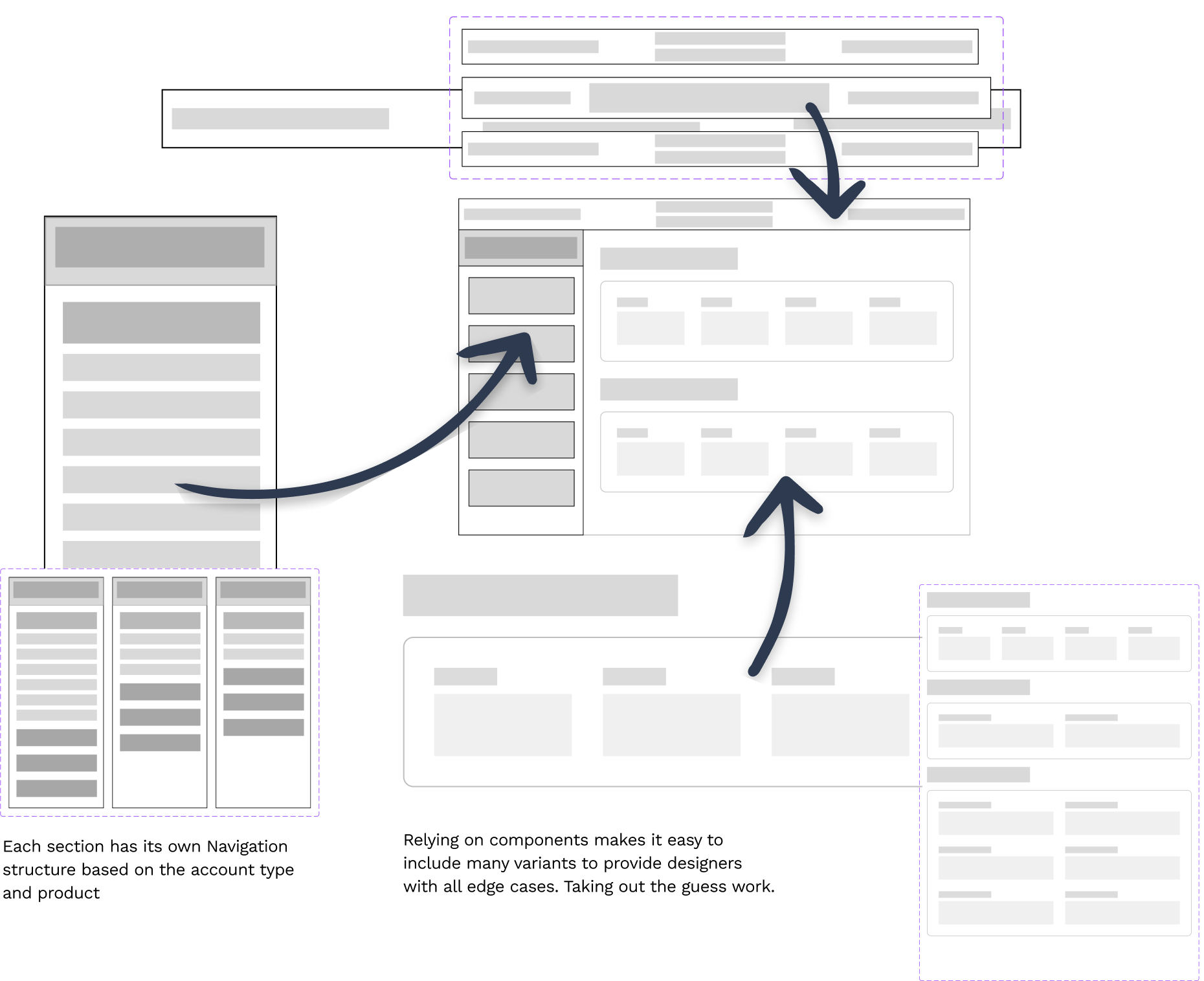
Ensuring that this toolkit would be flexible enough to cover all of the modal screens:
Limited by the Atomic Approach: Many traditional design systems primarily serve as collections of styles and components, akin to a palette from which designers can select elements for their projects. While this approach provides a foundation for design consistency, it can be remarkably challenging to use and maintain in practice. Designers often find themselves navigating vast libraries of components, searching for the right elements, and then manually applying styles and variations. This process not only consumes precious time but can also lead to inconsistencies and design bottlenecks.
Compose vs Configure
At the 2022 CONFIG conference, I came across a thought-provoking concept that challenged the traditional approach to design systems. It emphasized that not all designers require the flexibility of building designs from the ground up using individual components. Instead, many designers primarily need complete screens and layouts to work with. This concept prompted a shift in perspective, encouraging designers to rethink their workflow and prioritize working with full pages and layouts. An article on Smashing Magazine titled "Composition-Based Design System in Figma" further elaborated on this idea, advocating for a more efficient and user-centric approach to design, where designers focus on creating holistic and complete design solutions rather than endlessly assembling individual components.
This paradigm shift in design thinking is a valuable reminder that the most effective design processes are those that align closely with the needs of the project and the team. While a comprehensive design system with building blocks can be powerful and versatile, it's essential to recognize that not all projects require this level of granularity. By embracing the concept of full pages and layouts, designers can streamline their workflow and better cater to the specific demands of their projects, ultimately delivering more efficient and user-friendly design solutions.
you should definitely read it, its what I basically copied to create this pattern:
Go to the Article >>
A Better Way
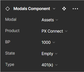
The introduction of a single component, coupled with Figma's Design Panel, aimed to simplify the design process and enhance user-friendliness. It consolidated diverse design elements into one versatile component, enabling designers to easily customize layouts with a few clicks, expediting the design process and ensuring consistency.
This concept emerged from my experience in creating alternative sizes and variations for various projects. I realized that a unified component with Design Panel features could bridge creativity and efficiency, simplifying workflows and demonstrating Figma's ability support the entire design ecosystem.
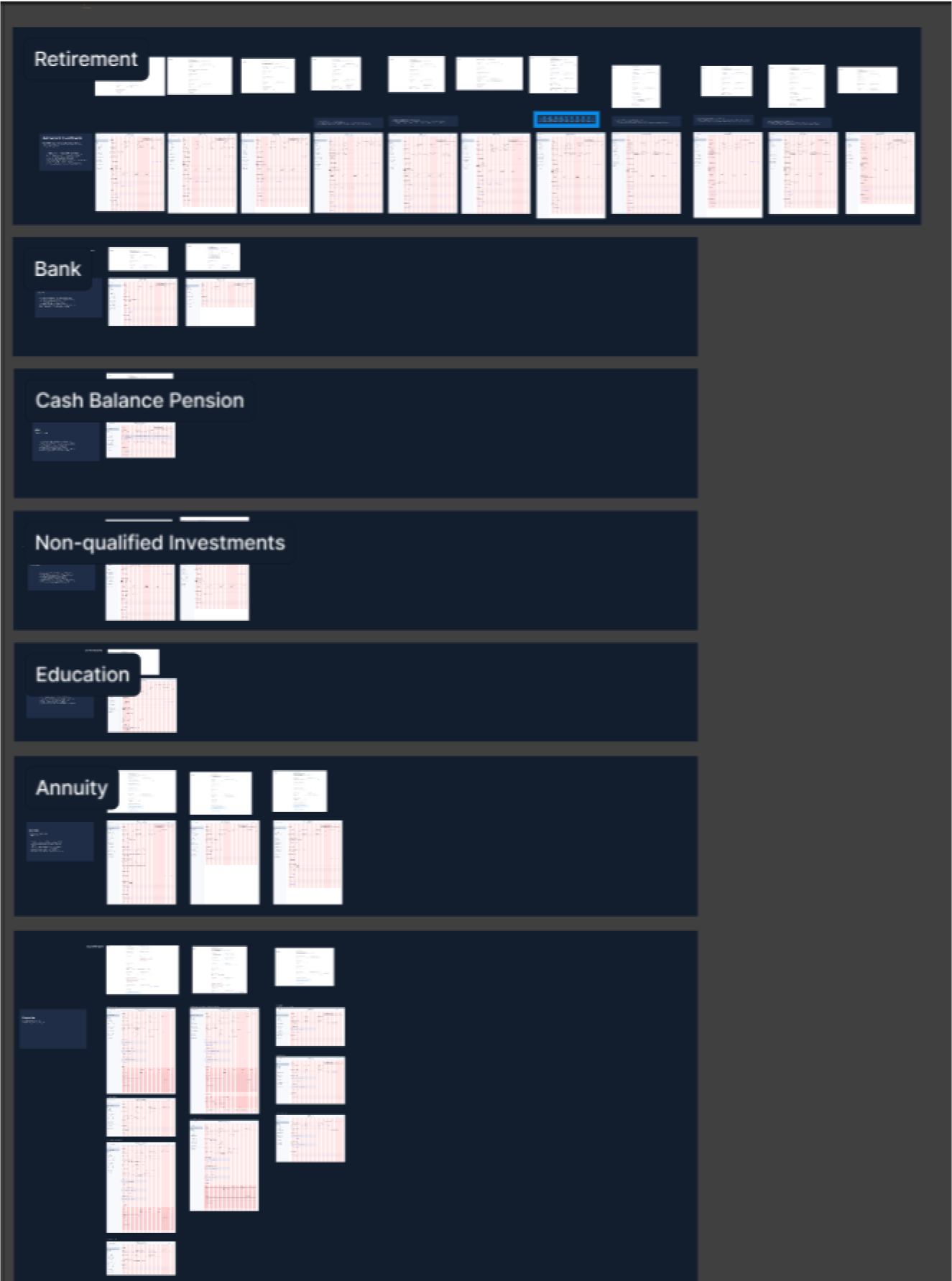
Scaling this to all of PX
Now it came to working with the product team to create each screen to support the scrum team doing this work.
Creating a Configurable Component
The design pattern introduced proved highly versatile, accommodating a wide range of design needs effortlessly. Its flexibility made it suitable for 100% of design scenarios, regardless of complexity. By offering a detailed Figma component structure and project initiation steps, it provided designers with a clear and efficient starting point, accelerating the design process and improving collaboration and consistency.
Over time, the design library underwent meticulous refinement, addressing even the most intricate edge cases. This dedication resulted in a robust and dependable tool, enabling designers to confidently tackle diverse project challenges. The library's maturation highlighted its adaptability, cementing its role as a valuable asset in a designer's toolkit, capable of evolving alongside changing design demands.
Final Thoughts
Exciting Improvement: The introduction of a new design library and toolkit marked a significant advancement in design efficiency and organization, promising an exciting leap forward from the previous tools. Limited Adoption: Unfortunately, initial enthusiasm was dampened by the low adoption rate within the team, with only the myself and one junior designer are using the toolkit. This raised concerns about the toolkit's accessibility and usability for the wider team. I will lose sleep wondering why more designers didn't apopt the Design System. Skills Gap: Further investigation revealed a major barrier to adoption - a significant portion of the team, including some managers, lacked proficiency in Figma, hindering their ability to leverage the toolkit effectively or lead design work. Gradual Onboarding: Despite the challenges, I persisted in onboarding additional designers to the toolkit over time. This gradual adoption supported all design deliverables and streamlined the maintenance of a centralized library for 5 Designers. Cultural Shift: Through patience, strategic onboarding, and a focus on fostering a culture of learning and collaboration, the improved toolkit began to gain traction within the team. Effective communication and adaptability helped bridge the gap between innovation and adoption, enabling the entire team to harness the benefits of the enhanced design infrastructure.