Intelligent Portfolio Dashboard
My Role: Lead Product Designer
Completed: Jan 2025
Focus: Information architecture, interaction design, visual design, prototyping
-
Overview
This project explores a modern portfolio management experience designed to help users understand their financial position at a glance and take confident action. The goal was to create a dashboard that blends real time market context, personalized insights, and actionable recommendations in a single, intuitive surface.
-
My Role
I led end to end product design, from early exploration through interaction design, visual design, and prototyping. I partnered with product and engineering to define the information architecture, data hierarchy, and the logic behind personalized recommendations.
-
Goals
- Clear understanding of financial health
- Surface relevant market context
- Actionable, personalized advice
- Build trust through clarity and motion
- Foundation for AI-driven insights
-
Visual Style & Approach
Clean, modern design with a dark theme and high contrast accents. Used design tokens from the company website to move fast. Competitor analysis of Robinhood, E*TRADE, and Personal Capital informed our approach to portfolio presentation and personalized advice.
-
Understanding capabilities
This was an exploration of technical capabilities, focusing on what data sources were available and how we could leverage AI to provide valuable insights and recommendations at scale.
- Getting Market Information: Understanding how the market is performing and what factors are driving changes.
- Market Prediction: Providing forecasts and insights into potential market trends to help users make informed investment decisions and improve engagement.
- AI-Powered Portfolio Analysis: Leveraging machine learning to analyze the user's portfolio performance, gains, losses, and risk exposure in real-time, surfacing patterns and anomalies that might otherwise go unnoticed.
- Personalized AI Recommendations: Using AI integrations to generate actionable advice tailored to the user's financial goals and risk tolerance, with recommendations that evolve as market conditions and user circumstances change.
- Budgeting: Helping users manage their spending and savings to achieve their financial goals.
- Financial Education: Providing educational content to help users make informed decisions about their investments.
-
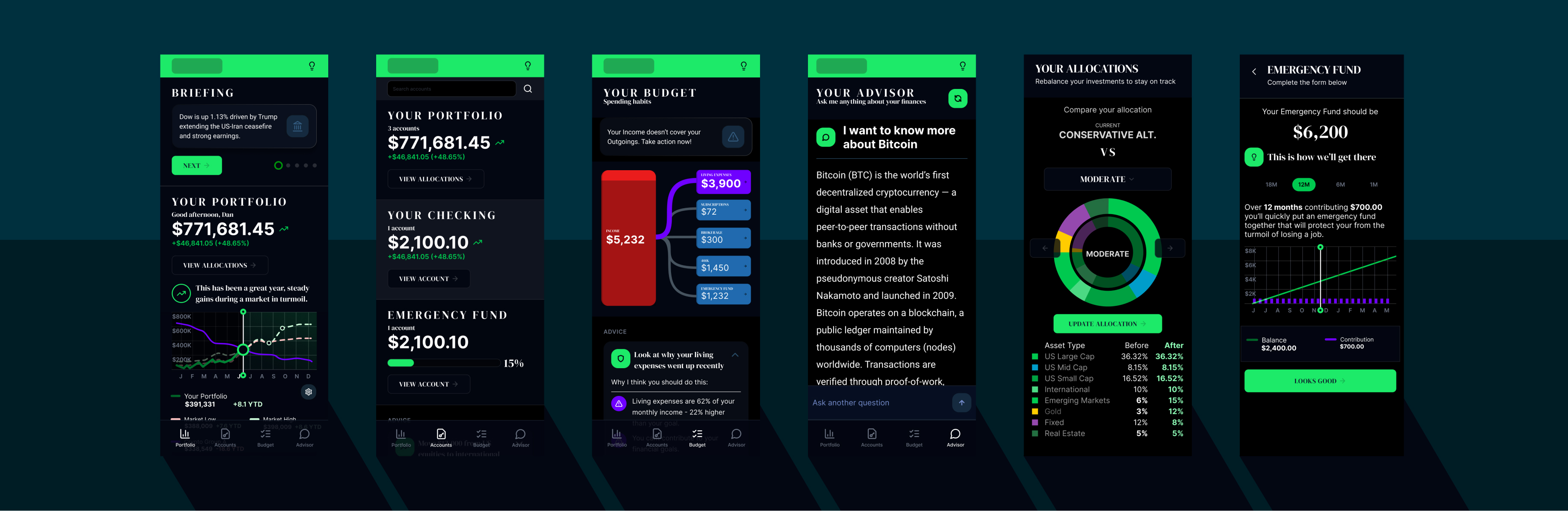
Dashboard ideation
Clarity over complexity: The interface uses a dark theme with high contrast accents to highlight key numbers. Typography and spacing were tuned to reduce noise and make the dashboard feel stable and trustworthy.
Predictable navigation: The bottom navigation organizes the experience into four clear modes: Portfolio, Accounts, Budget, Advisor. This keeps the dashboard focused while giving users room to explore deeper tools.
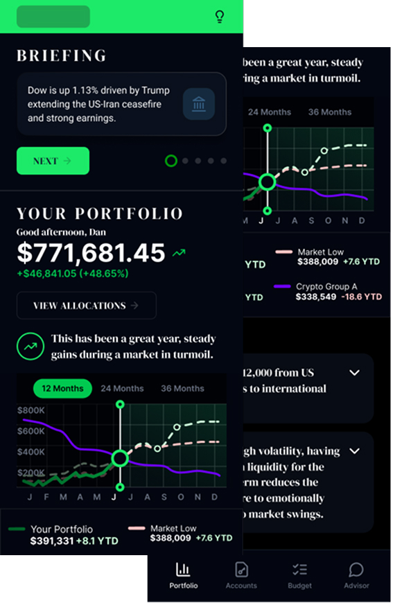
- Unified briefing layer: The experience opens with a concise market briefing that explains why the market is moving. This reduces anxiety and helps users interpret their portfolio performance in context. The briefing is short, scannable, and written in plain language.
- Portfolio view that answers the right questions: The portfolio module focuses on three core questions: how am I doing, am I ahead or behind the market, and what is driving the change. A clean hierarchy, a single performance graph, and benchmark comparisons give users a grounded sense of progress.
- Actionable, personalized advice: Instead of generic tips, the app provides specific recommendations tied to the user holdings and liquidity. Each suggestion includes a clear action, the rationale, and a quick action button. This reduces friction and helps users make decisions without digging through menus.
- Guardrails for volatile markets: A secondary advice layer reinforces financial hygiene, such as maintaining liquidity during high volatility. These insights are calm and non urgent, designed to build trust rather than push transactions.
-
Simple Foundations
MVP: Without unnecessary features, the design focuses on core functionalities that deliver immediate value to the user.
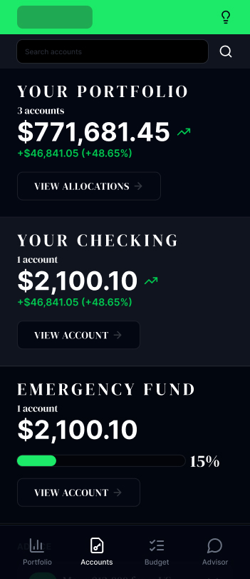
- Clear account hierarchy: All accounts are displayed with consistent labeling, current balance, and account type. This makes it easy for users to locate specific accounts and understand their overall portfolio composition at a glance.
- Account performance at a glance: Each account shows year-to-date returns and contribution history. Users can quickly compare performance across accounts and identify which accounts are outperforming or underperforming.
- Quick access to account actions: Deposit, withdrawal, and rebalancing options are surface-level actions. Instead of navigating through menus, users can perform common transactions directly from the accounts view, reducing friction and saving time.
- Consistent design language: The accounts page maintains the same visual style and interaction patterns as the portfolio page, creating a cohesive experience across the app.
-
Budgeting
MVP: During the initial design sprint we focused on identifying the key features that would provide immediate value to users, ensuring a streamlined and intuitive budgeting experience.

- Spending overview: Budget categories are organized with current spending, limits, and progress indicators. This makes it easy for users to understand where their money is going and stay within their budgets.
- Budget performance at a glance: Each category shows month-to-date spending and historical trends. Users can quickly identify which categories are on track and which may require adjustments.
- Quick access to budget actions: Add budget, modify limits, and view transaction details are surface-level actions. Instead of navigating through menus, users can manage budgets directly from the budgeting view, reducing friction and saving time.
Impact
- Faster comprehension of portfolio performance
- Higher trust in recommendations
- Reduced anxiety during volatile periods
- Increased engagement with advice modules
Reflection
This project reinforced the value of designing for emotional clarity, not just data clarity. Users do not need more numbers. They need context, guidance, and a sense of control. The final experience delivers all three in a focused, approachable way.
