
Design System Infrastructure
My Role: Lead Product Designer
Completed: October 2024
Team Size: 1 Sr UX Designer
Problem
There was no Design System and there were 10 projects to support.
Solution
Create a robust Design Infrastructure to improve design efficiency and increase the number of prototypes one designer can build.
Introducing the Team to Design Systems
Most of the product team was new to design systems and their benefits. I gathered some of the best explanations on why to use design systems and reviewed these resources with the product team to highlight their importance.
Design Systems 101 - NN Group
Six Myths Holding You Back from Embracing Design Systems
The Future of Design Systems is Semantic
How Spotify's Design System Goes Beyond Platforms
Benefits of a Design System
I wanted to show the product team that a design infrastructure would not only support our work but also be an essential step in bridging from Figma to code.

The Process
To create a robust Design System, we followed a structured process that ensured consistency, scalability, and efficiency. Here are the key steps we took:
- Research and Planning: Conducted thorough research on design systems and planned the structure and components needed for our projects. This involved understanding the needs of our projects and identifying the best practices in the industry.
- Design Tokens: Established design tokens for colors, text styles, spacing, and effects to ensure consistency across the system. Design tokens are the core elements that define the visual style of the design system.
- Component Creation: Developed reusable components using Atomic Design principles, ensuring they were scalable and maintainable. Components were created to be flexible and adaptable to various use cases.
- Documentation: Documented the design system thoroughly to provide clear guidelines and usage instructions for the team. This included creating a comprehensive guide that detailed how to use each component and design token.
- Implementation: Integrated the design system into our projects, ensuring seamless transition from design to code. This step involved working closely with developers to ensure that the design system was implemented correctly.
- Feedback and Iteration: Gathered feedback from the team and iterated on the design system to continuously improve it. This involved regular reviews and updates to ensure that the design system remained relevant and effective.
Atomic Design Principles
I used Atomic Design principles to organize my design system. This approach helped in creating a scalable and maintainable design infrastructure.
- Atoms: Basic building blocks like buttons and input fields. These are the smallest and most fundamental elements in the design system.
- Molecules: Groups of atoms functioning as a unit, like a search form. Molecules combine atoms to create more complex components.
- Organisms: Complex components made of molecules and atoms, like a header. Organisms are larger components that form distinct sections of an interface.
- Templates: Page-level objects that layout components. Templates define the overall structure and layout of a page.
- Pages: Specific instances of templates with real content. Pages are the final stage of the design process, where templates are populated with actual content.
Design Tokens
These are the fundamental styling items that make up everything at Dark Matter. This will allow us to more easily keep a consistent palette and spacing, creating a robust but flexible styling system.
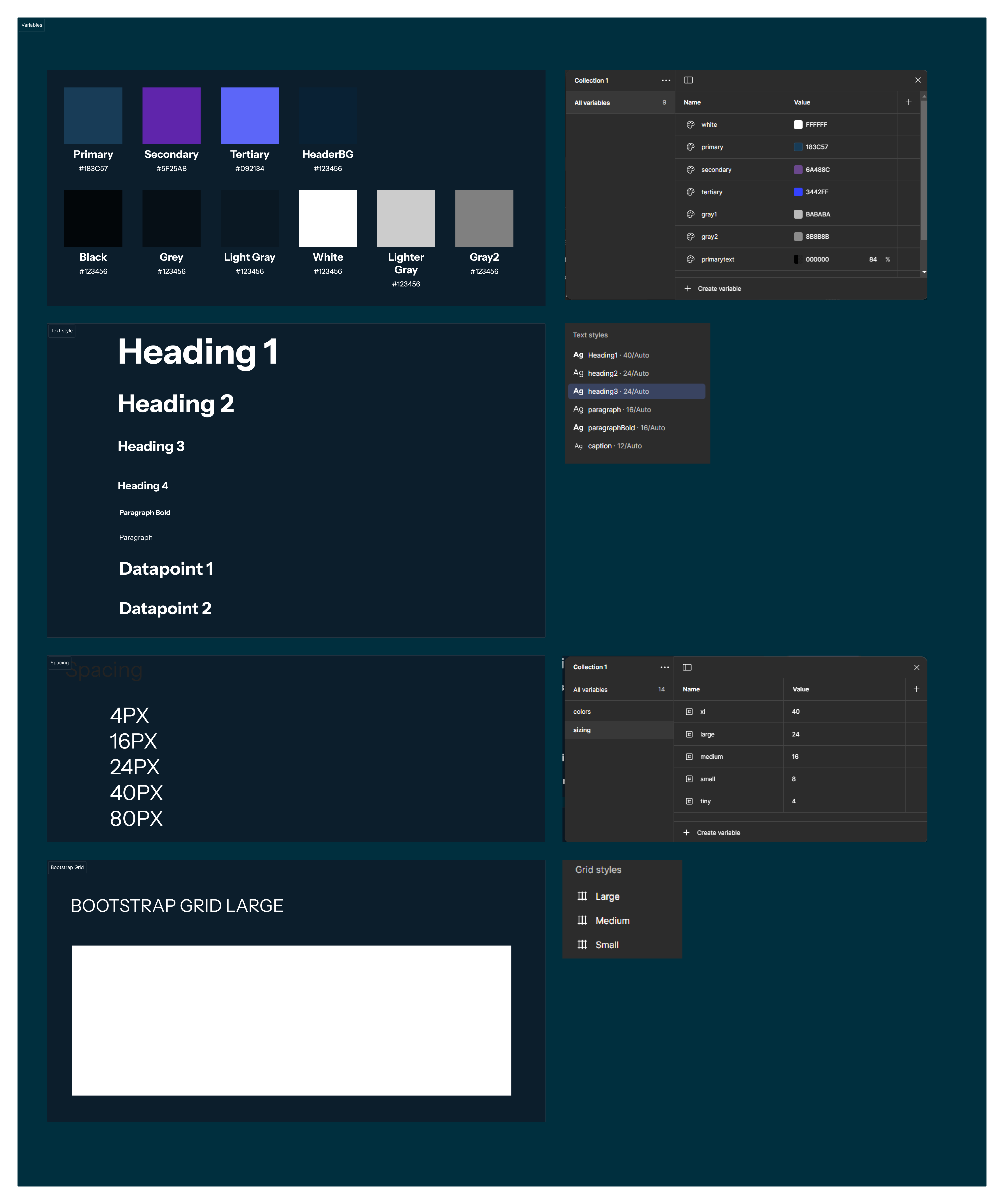
- Colors: Relying on terms like Primary, Secondary, Display; instead of hex values so that we can switch between colors and brands while the intention remains the same. This ensures that color usage is consistent and easily adjustable.
- Text Styles: Only predefined text styles should be used. This means the Figma should not have orphan text styles. Consistent text styles help maintain a unified look and feel across all designs.
- Spacing Tokens: There shouldn't be orphan numbers like 5px or 10px or 12px. ONLY a spacing token is correct. This will help ensure designs can fit to the Foundations Grid. Consistent spacing ensures that layouts are well-structured and visually appealing.
- Effects: To ensure reusability and consistency. Effects like shadows and gradients should be predefined to maintain a consistent visual style.
Creating Components
At this stage I already had some local components that were used for other projects, so they were used as the starting point.
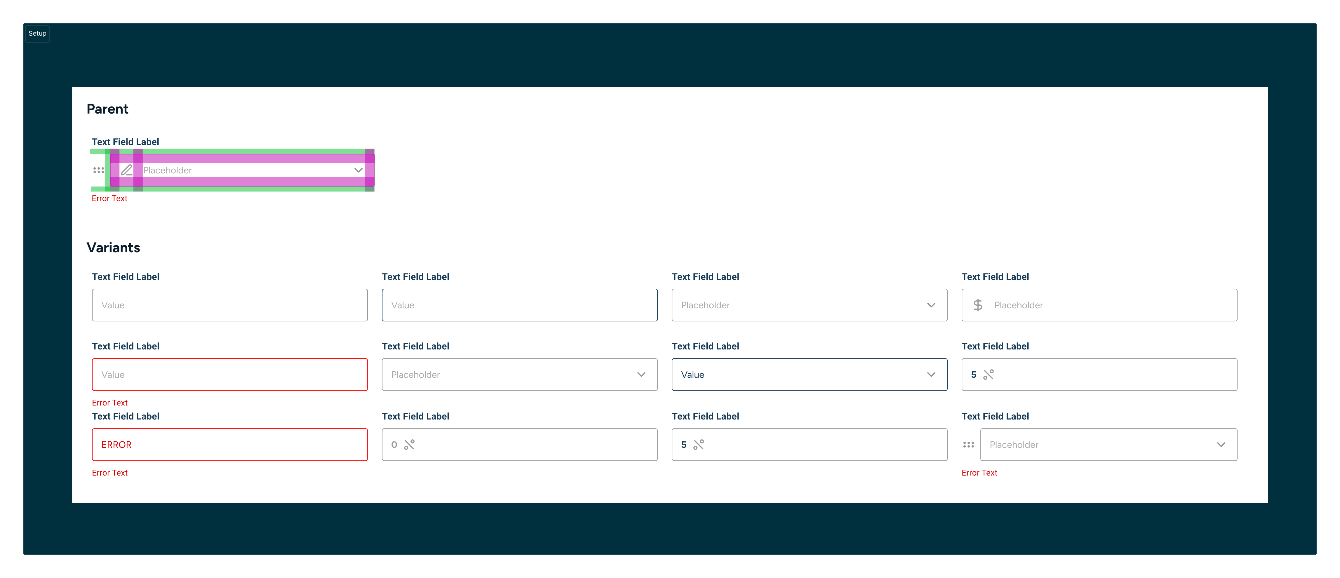
- Auto Layout: Utilizing Auto Layout is crucial for speeding up the iterative design process. It allows for flexible and responsive designs that adapt to different screen sizes and content changes.
- Variants: Creating variants for components helps in managing different states and variations of a component. This makes it easier to switch between different styles and states without duplicating components.
- Design Tokens: Implementing design tokens for colors, text styles, spacing, and effects ensures consistency across the design system. Design tokens help in maintaining a unified design language and make it easier to update styles globally.
- Never Use Lines or Rectangles: Avoid using lines or rectangles for anything other than exploration. Instead, use predefined components and shapes to maintain consistency and ensure that designs align with the overall design system.
- Structure: Maintaining a clear and organized structure is vital. Components should be named and grouped logically, reflecting their hierarchy and relationships. This makes it easier to navigate and manage the design system.
When creating components, it's essential to follow certain principles to ensure consistency, reusability, and efficiency. Here are some key principles we adhered to:
Efficiency Principles
Most designers don't need the flexibility of creating individual components from scratch. Instead, focusing on a core set of well-documented and reusable components is more effective. Here are some principles to consider:
- Auto Layout: There are so many layout features that can be used to speed up the iterative design process that using Auto Layout is essential.
- Using shapes for anything other than exploration is a bad idea.
- Use variants to create ready-to-go states so that most states of the app can be easily replicated in Figma.
- Need a process for adding new Components so that as our platforms grow, we can be intentional about which Components need to be in the library and which are just local ideas.
- Create grids based on the Foundation Grid to ensure consistency and alignment across all design elements.
Use Components
Having created Components, now it's time to actually use them in sprint work and start aligning common patterns inside the Figma files.
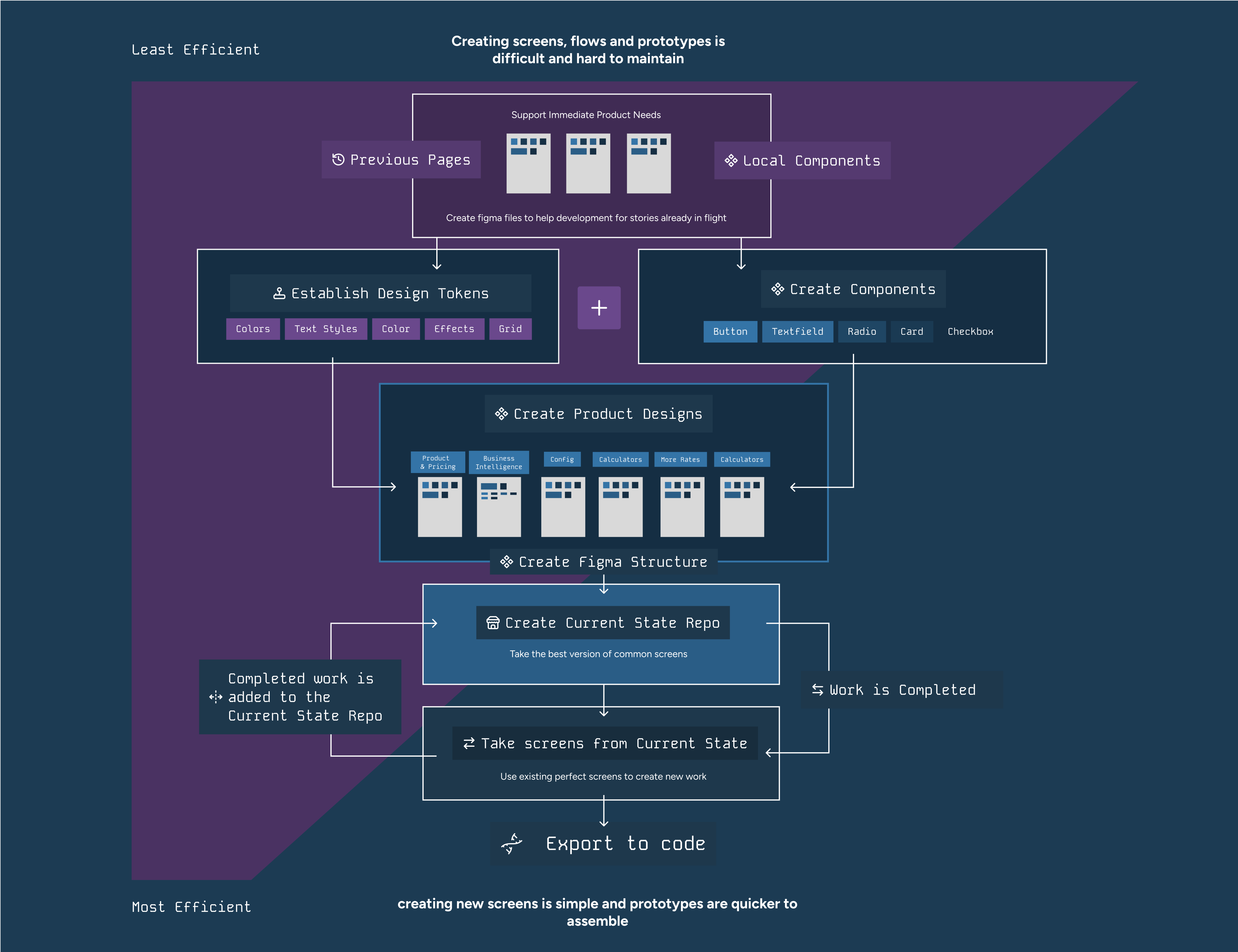
Using the work in sprints to create 'Current State' files, this was done over the course of a couple of months.
- Design Tokens: Implemented design tokens for colors, text styles, spacing, and effects to ensure consistency and reusability across the design system.
- Central Library of Components: Created a central library of components that mirrored the HTML structure, ensuring that all components were well-documented and easily accessible for reuse.
- Auto Layout: Ensured that all components used Auto Layout to speed up the iterative design process and maintain consistency. All Auto Layouts utilized design token spacers to align with the Foundations Grid.
Creating Current State
This involves collating all of the most current screens into one place.
- Inventory Creation: Gathered all separate screens, files, and Figma designs to create a comprehensive inventory. This step ensures that all design assets are accounted for and organized.
- Organized Files: Sorted and categorized the figma file based on project relevance and design stages. This helps in maintaining a clear structure and easy access to relevant designs.
- Standardized Naming: Implemented a consistent naming convention for all files to ensure easy identification and retrieval. Consistent naming helps in avoiding confusion and ensures that files are easily searchable.
- Central Repository: Created a central repository to store all the organized files and designs. This repository serves as a single source of truth for all design assets.
- Documentation: Documented the inventory process and the structure of the repository for future reference. Proper documentation ensures that the process can be easily followed and replicated in the future.
- Review and Validation: Conducted a thorough review to ensure all files were accounted for and correctly categorized. This step ensures that the inventory is complete and accurate.
Exporting to Code
Handing off meticulously crafted Figma files with prototypes and detailed annotations explaining features is fantastic, but what's even better is seamlessly transitioning from Figma to code, significantly reducing development overhead. Here are some key strategies to achieve this:
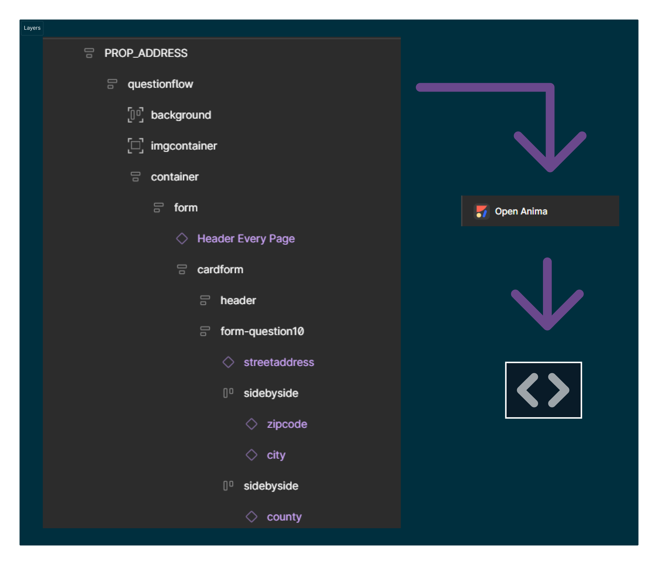
- Semantic Layers: Ensure that the Figma layers reflect the expected DOM structure. This approach allows for production-ready code that leverages a component library to maintain consistency and expedite development.
- CSS Flexbox and Auto Layout: Understand that CSS Flexbox and Figma's Auto Layout share similar principles, facilitating a smoother transition from design to implementation.
- Design Tokens: Utilize design tokens for styling to ensure consistency throughout the project. Design tokens help in standardizing design decisions and making them reusable across different platforms.