
LOP Dashboard
My Role: Lead Product Designer
Completed: October 2024
Number of users: 150
Team size: 1 Sr UX Designer
- Problem
Users struggled to get a quick snapshot of their team's health, taking over 24 hours to generate necessary reports.Solution
Create a flexible data visualization tool for multiple roles. -
Discovery
Understanding how what the existing team thought this should be would help us move quickly into more developed ideas.

- Stakeholder Interviews: Documented team goals and success metrics.
- User Interviews: Conducted workshops to synthesize findings and align on key insights.
-

Understand Users
- Storyboard: Worked with a BA to learn about the problems faced.
- Persona Review: Reviewed sales-focused personas created by an outside resource.
-
Competitor Analysis
Analyzed competitors to identify industry standards and best practices.
- Competitor Analysis Workshop: Evaluated other data visualization tools and gathered team opinions.
-
Synthesize Findings
Documented insights to validate assumptions and align the team.
- Discovery Synthesis Workshop: Synthesized findings and aligned on key insights.
- Journey Map (Current State): Created a journey map to document the current state experience.
-
Define
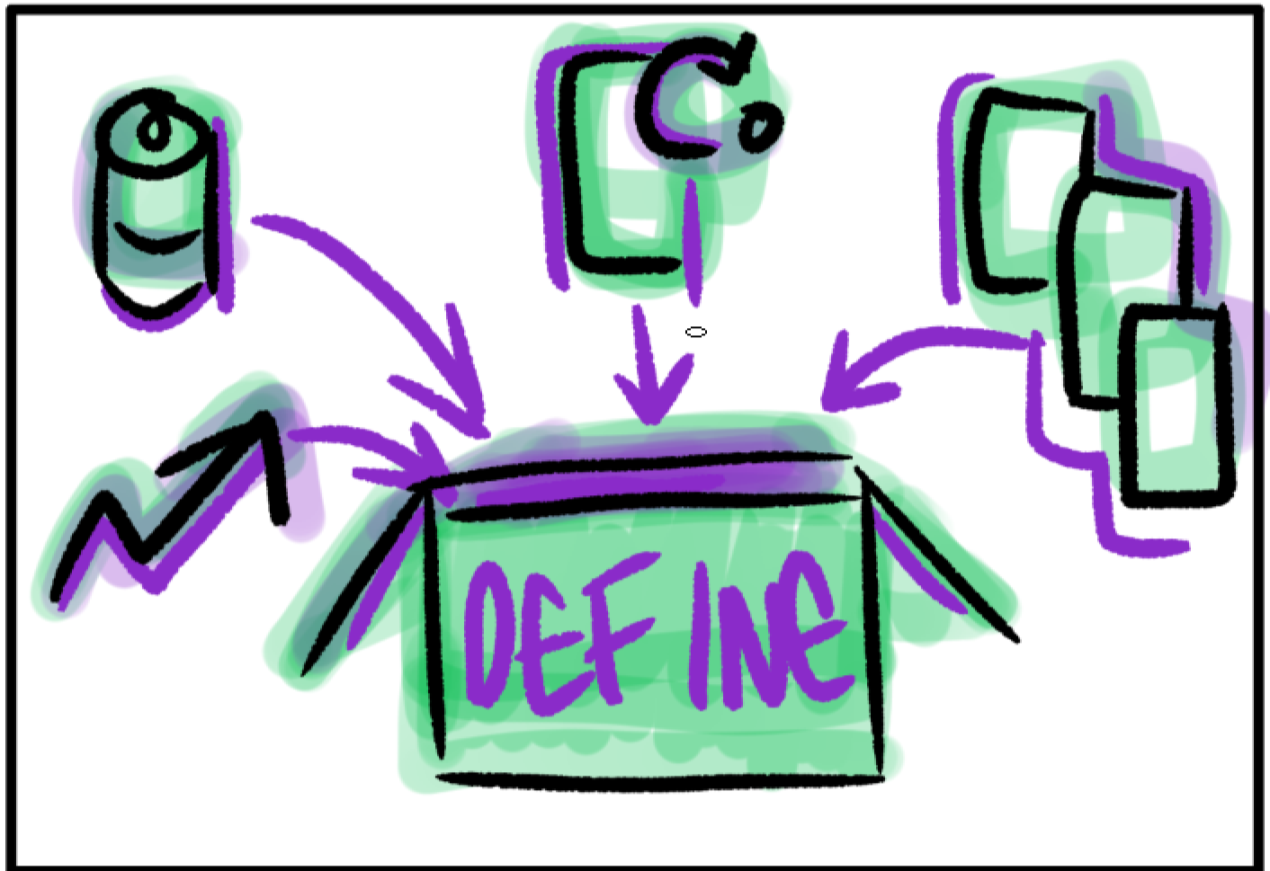
- Reduce data overload for quick insights into team performance.
- Speed up report generation for timely decision-making.
- Consolidate information for a comprehensive view of team performance.
- Engage users for meaningful feedback and improvements.
- Ensure data accuracy to build trust in reports.
-
Ideate
Generated a wide range of ideas through collaborative ideation.
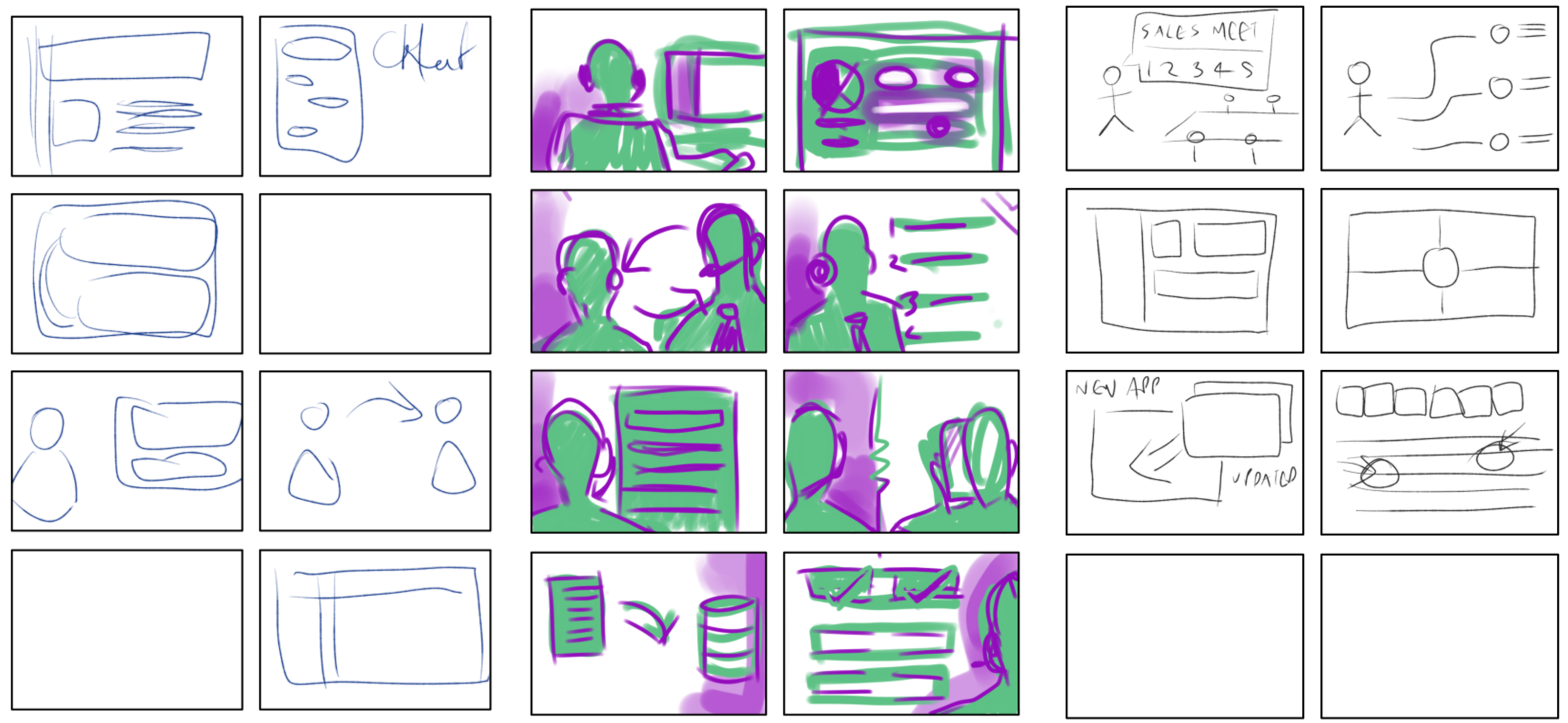
- Collaborative Ideation: Generated diverse ideas through multiple rounds of Crazy 8's.
- Diverse Perspectives: Incorporated diverse perspectives for a comprehensive approach.
- Iterative Refinement: Refined ideas through iterative rounds.
-
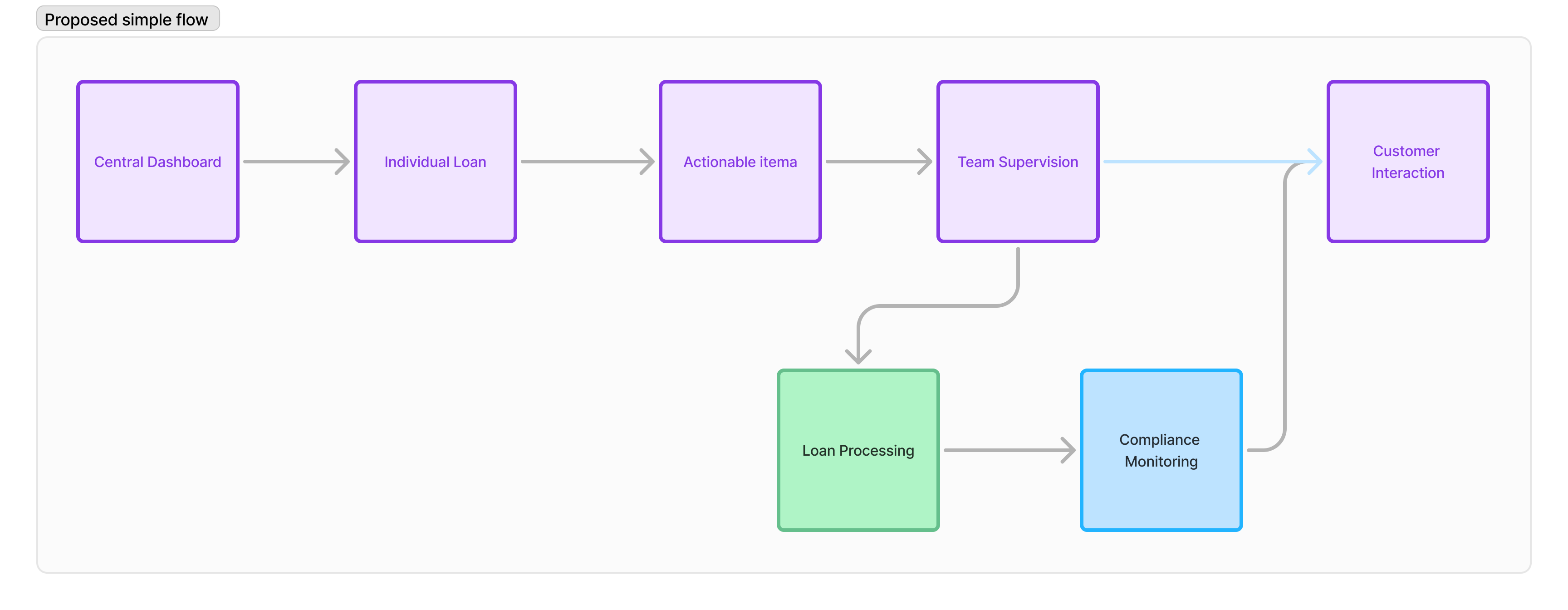
Simple Task Flow
Documented the process for early issue identification.
- Central Dashboard: Provides an overview of key metrics and performance indicators.
- Individual Loan: Detailed view of each loan's status and progress.
- Actionable Items: Highlights tasks and actions that require immediate attention.
- Team Supervision: Tools for monitoring and managing team performance.
- Loan Processing Tasks: Step-by-step tracking of loan processing activities.
- Compliance Monitoring Tasks: Ensures adherence to regulatory requirements and standards.
-
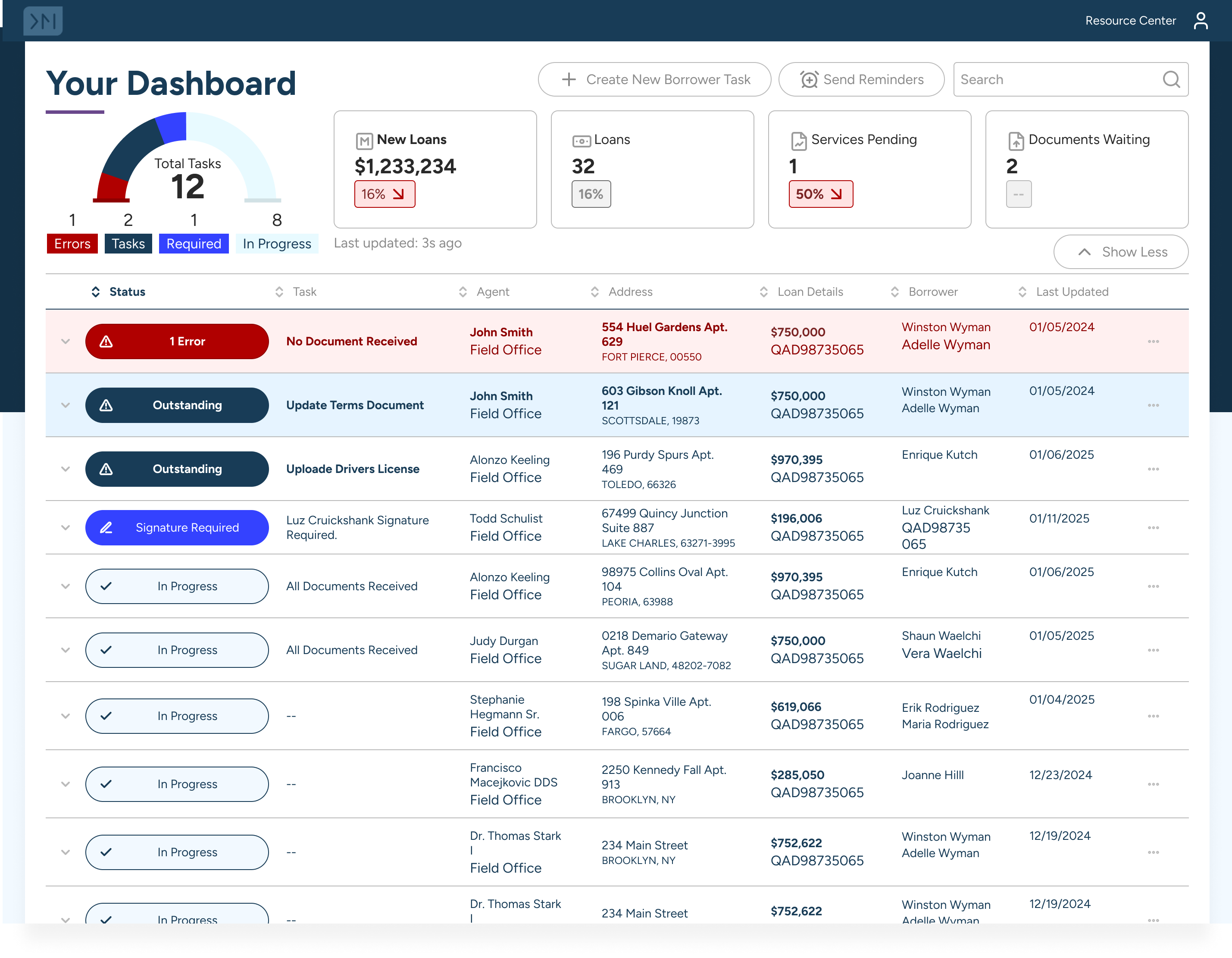
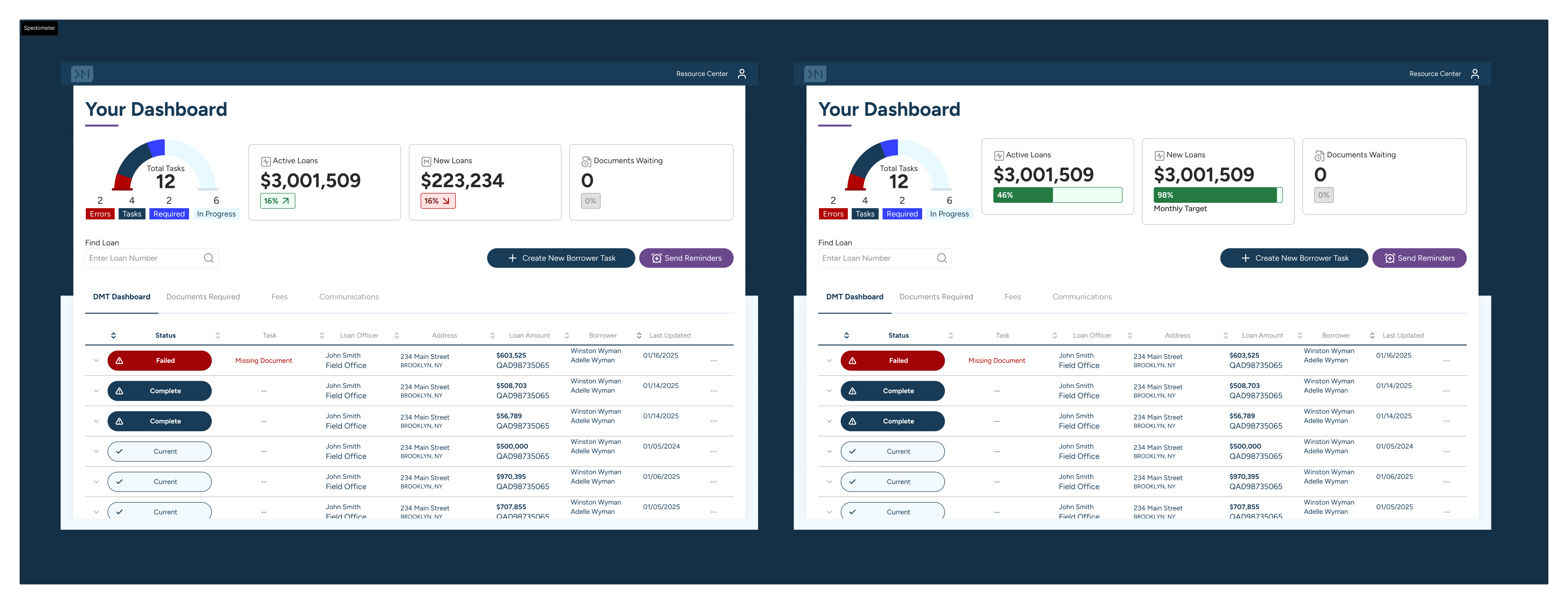
MVP List view
The MVP list view provides a streamlined interface for managing and tracking applications. I leaned on simple design patterns to create a user-friendly table experience that could be easily built upon.
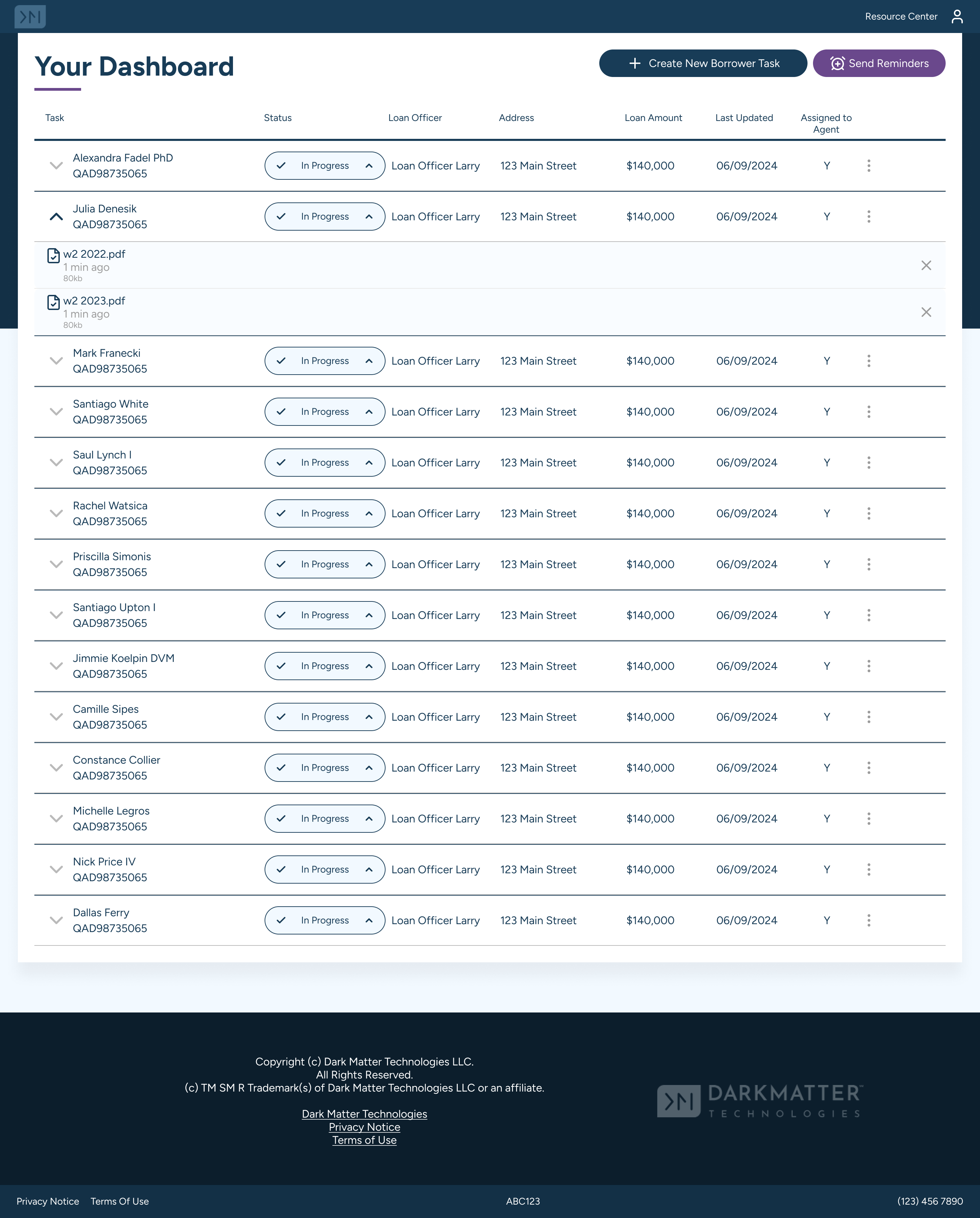
- Show all applications.
- Show statuses at a glance.
- View documents.
- Show which applications require action.
- Show which applications are active.
- Allow user to create new Tasks
- Allow user to set reminders
- Allow simple sorting.
Requirements
Feedback
- Loan Officers find it more useful to see which loans or applications require action.
- Tasks are the most critical aspect for Loan Officers.
- Users need to see how many tasks are pending.
- Users loved the readability of the table view.
- Users wanted to see more status based information.
- Users wanted to see more information about the applications without having to click into them.
-
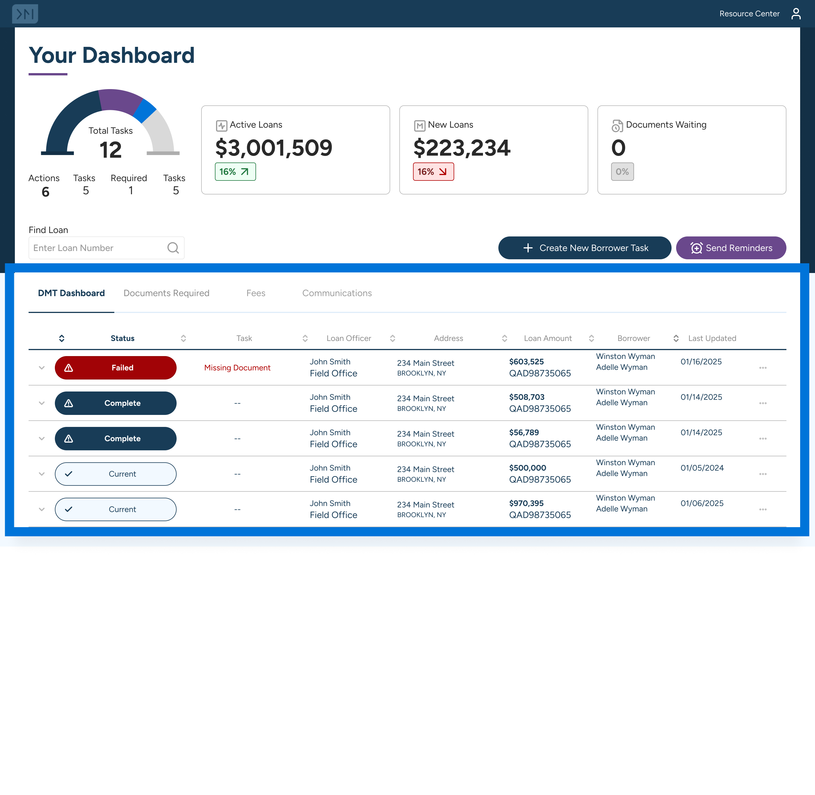
Adding Statuses
Based on feedback from users, I added statuses to the list view. I also showed a few of the different statuses on the table view, so that we can start evaluating whether this approach made it easier for users to understand the status of their applications when there was more than 1 status.
Updated table view gives a better overall view of Pipeline Health. - At a glance view of Pipeline Health.
- Enough information visible to make decisions without needing to click into each application.
- Show Loan Officer Performance.
- Search functionality for quick access to specific applications.
Add working groups
During discussions with the Loan Officers, we identified the need to add working groups to better organize tasks and documents. Where different office locations or teams had specific responsibilities, working groups allowed for more efficient task management and document sharing.
- Some users pipelines would be more manageable with working groups.
- Users should be assigned groups, should not be able to create new groups.
Pipeline view
Lots of feedback from users highlighted the need for a more comprehensive pipeline view.
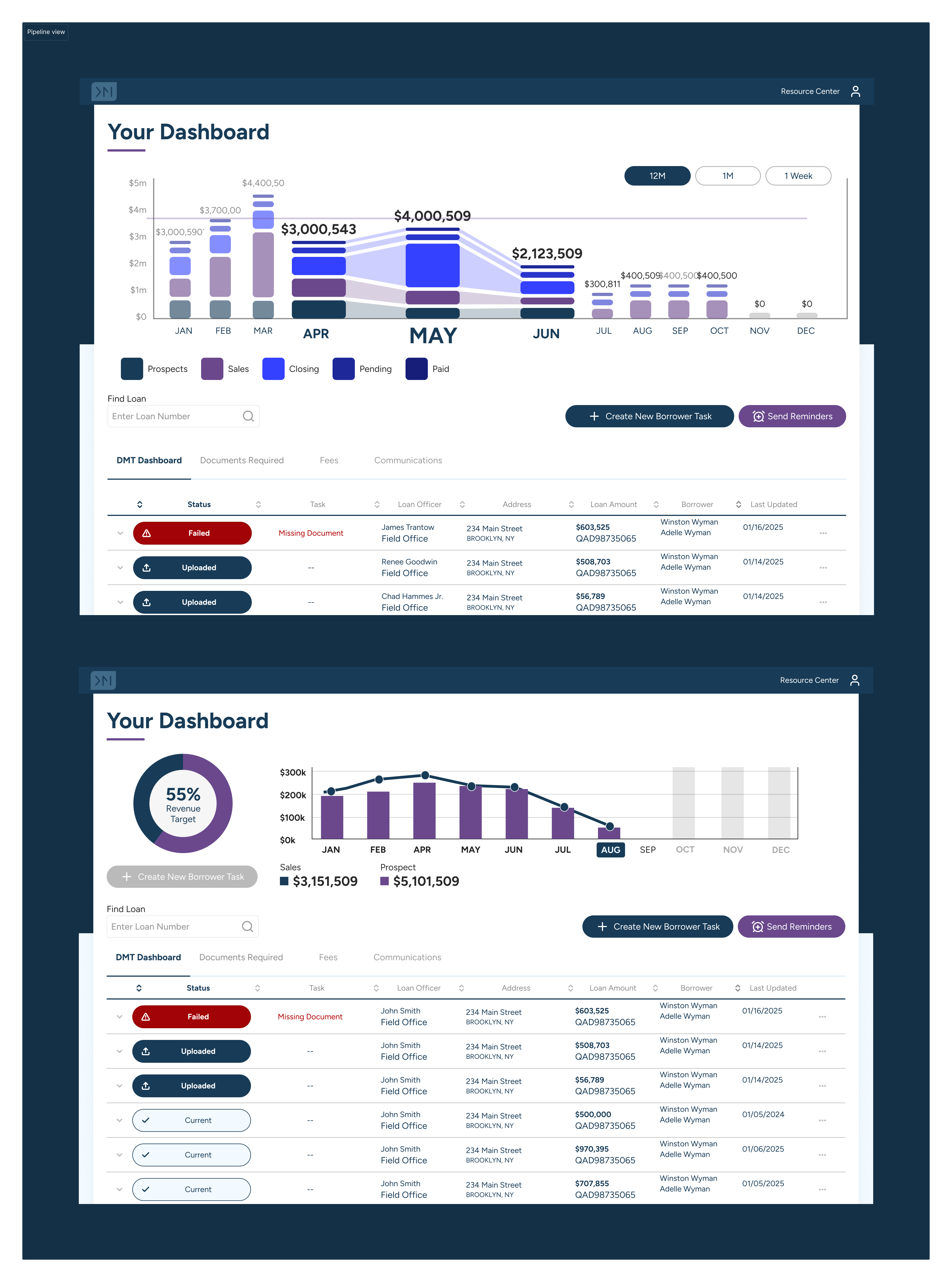
- Some users serving many teams will need to be able to see all teams from 1 view.
- Across workflow: See tasks from different workflows to get a comprehensive view.
- Future Pipeline: In conversations with the LO's it was clear that they would like a way to predict future tasks so that they can plan accordingly.
- Reduce complexity: Many of these tasks require multiple steps or involve multiple team members, showing it in a simplified manner helps users manage their workload effectively.
Easy Search
Creating an intuitive and efficient search functionality was a priority as this was rolled out to a larger group of users.
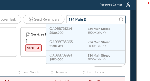
We started talking to stakeholders. - Search by any field:Dont make users guess which data point to enter.
- Easy to distinguish: There could be multiple applications with the same details so it should be consider how we display active loans vs dead applications..
Pipeline Health Improvements
Implemented simple, informative cards to display pipeline health, enhancing efficiency and accessibility.
- Loan Officers find it more useful to see which loans or applications require action.
- Tasks are the most critical aspect for Loan Officers.
- Users are less concerned with the total number of loans.
User Feedback
Added AI task suggestions
There were several reports that were run that needed to be surfaced to several users. This would help prioritize tasks and improve efficiency.
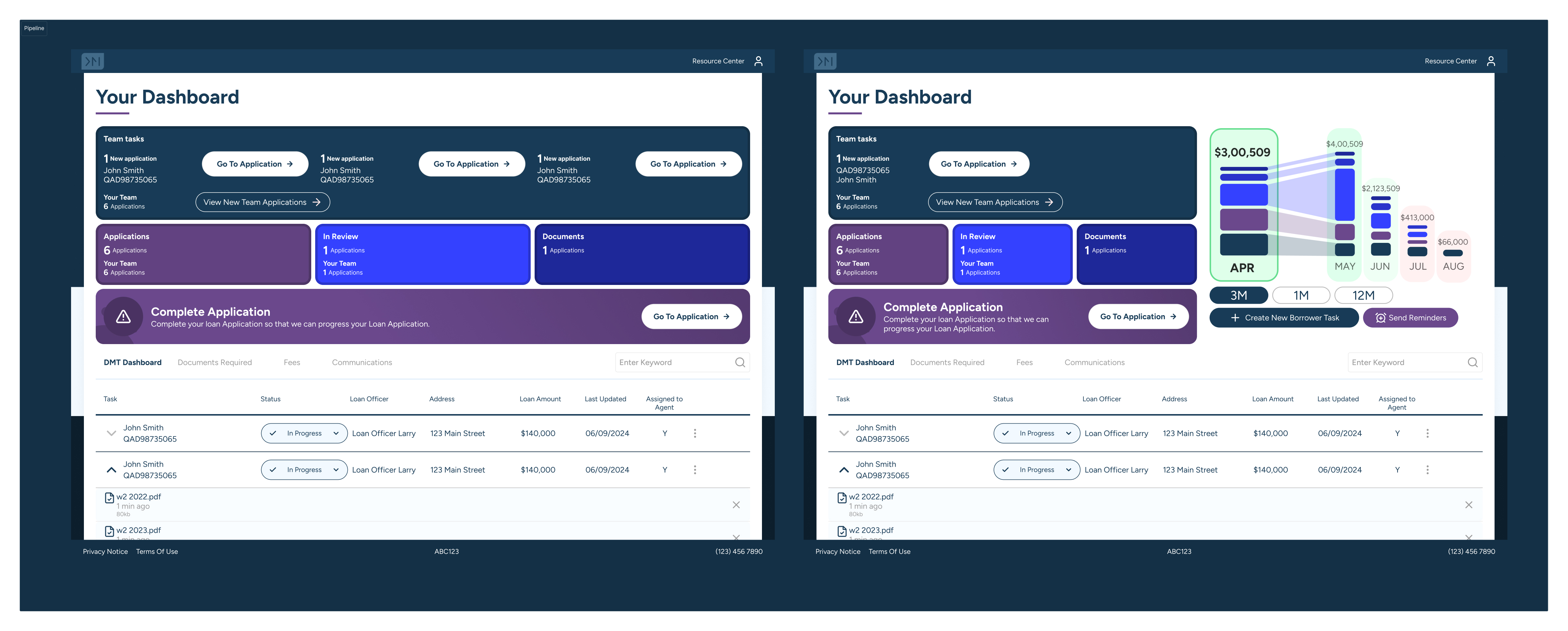
- When a new application is recieved check each application and assign it to the correct person.
- Alert issues - Surface critical alerts and potential problems that require immediate attention from authorized users.
- Difficult to make AI tasks relevant and timely.
- Work with stakeholders to ensure AI tasks align with business priorities.
User Feedback
Pipeline Visualization
Since we had so much access to the Loan Officers we wanted to get their insights on the pipeline visualization and used these as jumping off points for a workshop where we identified key areas for improvement.
- Different users have different data access levels.
- Many teams need to be able to see data from all teams from one view.
- Loan Officer Manager is a new role that requires specific persona updates.
- Across workflow: See tasks from different workflows to get a comprehensive view.
- Future Pipeline: In conversations with the LO's it was clear that they would like a way to predict future tasks so that they can plan accordingly.
- Reduce complexity: Many of these tasks require multiple steps or involve multiple team members, showing it in a simplified manner helps users manage their workload effectively.
- Users wanted to see more data visualizations to get a better understanding of their pipeline health.
User Feedback
Loan Officer Performance
After analyzing user feedback and performance metrics, we identified key areas for improvement in the dashboard, but we noticed that the main stakeholder had a different perspective on the priorities based on their role and responsibilities. Leading to this
- Display key performance indicators for a quick overview.
- Current performance metrics need to be more accessible and understandable for more stakeholders.
- Workgroups need better visibility and management tools.
- Include a task and activity tracker.
User Feedback
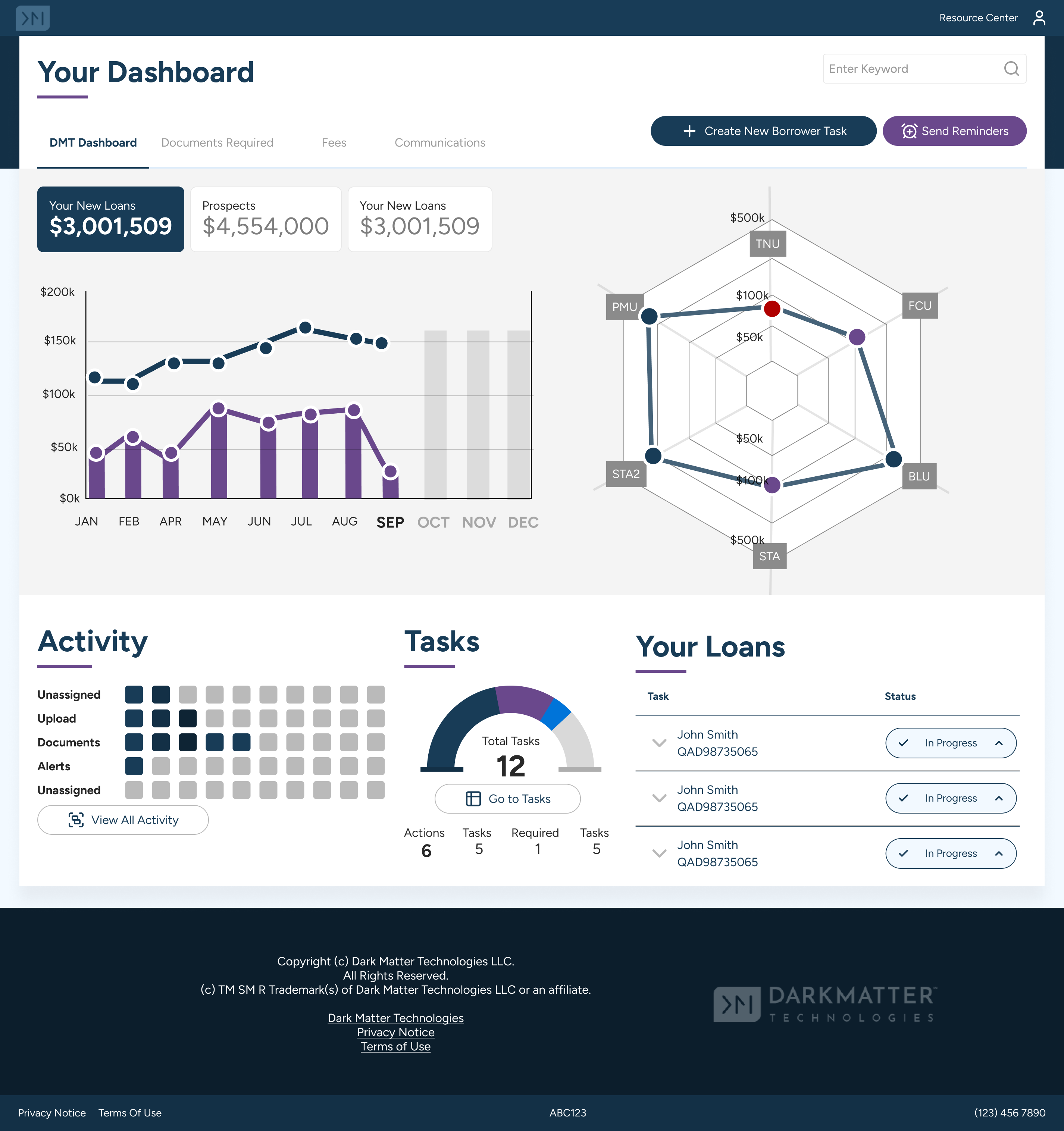
Dashboard showing relevant data Conclusion
The Business Intelligence project successfully addressed the challenges faced by Loan Officers and Managers by providing a flexible and customizable data visualization tool. The implementation of dense tables, clear statuses, and informative cards significantly improved the efficiency and accessibility of crucial information. Through continuous user engagement and feedback, the project ensured that the final product met the needs of its users, ultimately enhancing their workflow and decision-making processes. Clients have expressed their love for the new system, praising its user-friendly interface and the ability to quickly access and analyze data, which has greatly improved their overall productivity.