Park It Mobile App
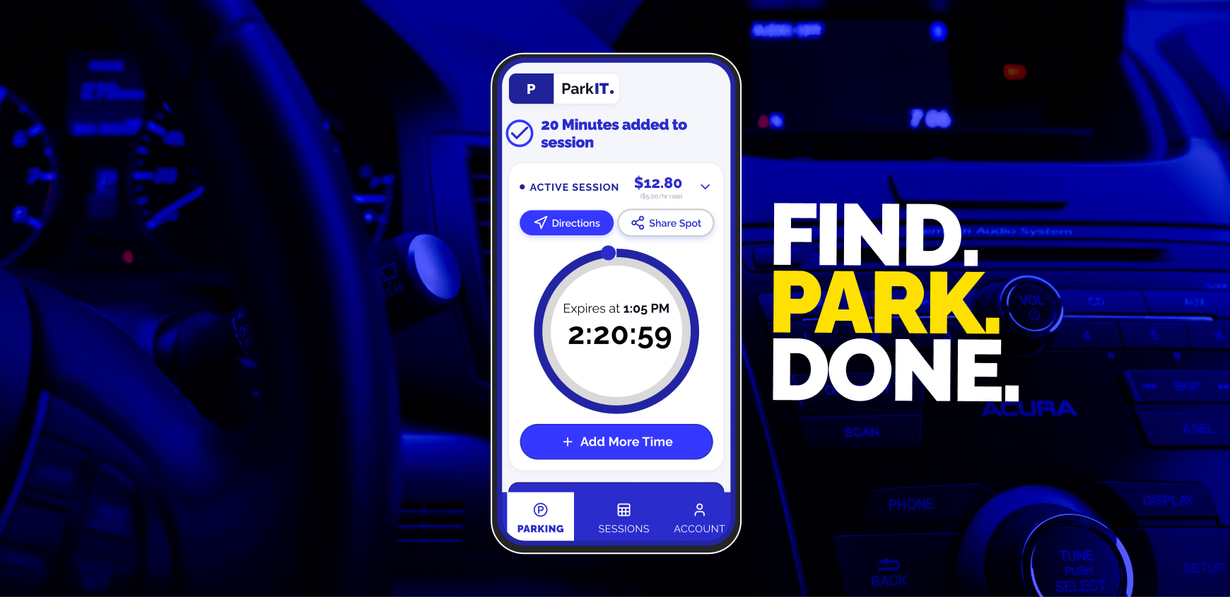
Role: Senior Product Designer
Team: 1 Lead Product Designer, 1 Senior Product Designer
Users impacted: 80,000+
-
Process
With tight deadlines and limited engineering resources, I focused on creating a unified parking workflow that minimized friction, reduced cognitive load, and delivered clarity across both street and garage parking.
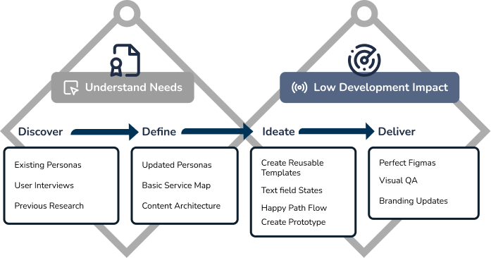
- Early-stage product
- Small developer allocation
- High stakeholder involvement
- 3 cross-functional alignment sessions per week
-
Overview
Urban drivers waste 17+ minutes per trip circling blocks, deciphering contradictory signage, and fumbling with fragmented payment apps. Through persona research, competitive benchmarking of 5 platforms, and structured design thinking workshops, we uncovered a critical market gap: no single app unifies street meters and off-street garages in one seamless experience.
- 73% of users abandoned existing parking apps mid-journey because listed spots were already taken. No competitor offers real-time sensor-validated occupancy — drivers arrive to find phantom listings and resume circling.
- Each city uses different zone-based apps with hidden fees. ParkMobile charges $0.35 convenience fees, PayByPhone varies by city contract, and municipal kiosks often reject valid cards.
Challenge
- Led design strategy and UX architecture for unified parking workflow
- Mapped end-to-end processes across all teams and systems
- Defined requirements and designed scalable interaction patterns
- User testing revealed apps guide drivers to a building but abandon them inside multi-deck structures — the #1 unaddressed pain point across all competitors.
My Role
Empathizing with users
Ethnographic observation, structured interviews, quantitative surveys, competitive benchmarking, and cross-functional design thinking workshops — building a 360° view of urban parking pain.

This persona helped the team empathize with the user and guide design decisions. - 5 Competitors Benchmarked
- Design Workshops
- User Stories Prioritized
 Design Strategy
Research findings
- 73% of drivers abandoned parking apps mid-journey. No platform offers real-time sensor-validated availability — the critical trust gap Park It could own.
- Primary persona Margaret Chen (68) showed that solving for low-tech confidence — large type, landmark-based directions, minimal steps — solves for everyone.
- Rose/Thorn/Bud themes: real-time pricing transparency and one-tap booking (roses); onboarding complexity, map literacy barriers, and last-50-feet confusion (thorns).

Map the Flow
Working with the Product Owner, I created a detailed journey map that aligned all teams on the current and future state of the unified parking experience.
- Map the full user and operational journey
- Identify workflow friction and dependencies
- Identify stakeholders and build cross-team alignment
Design Strategy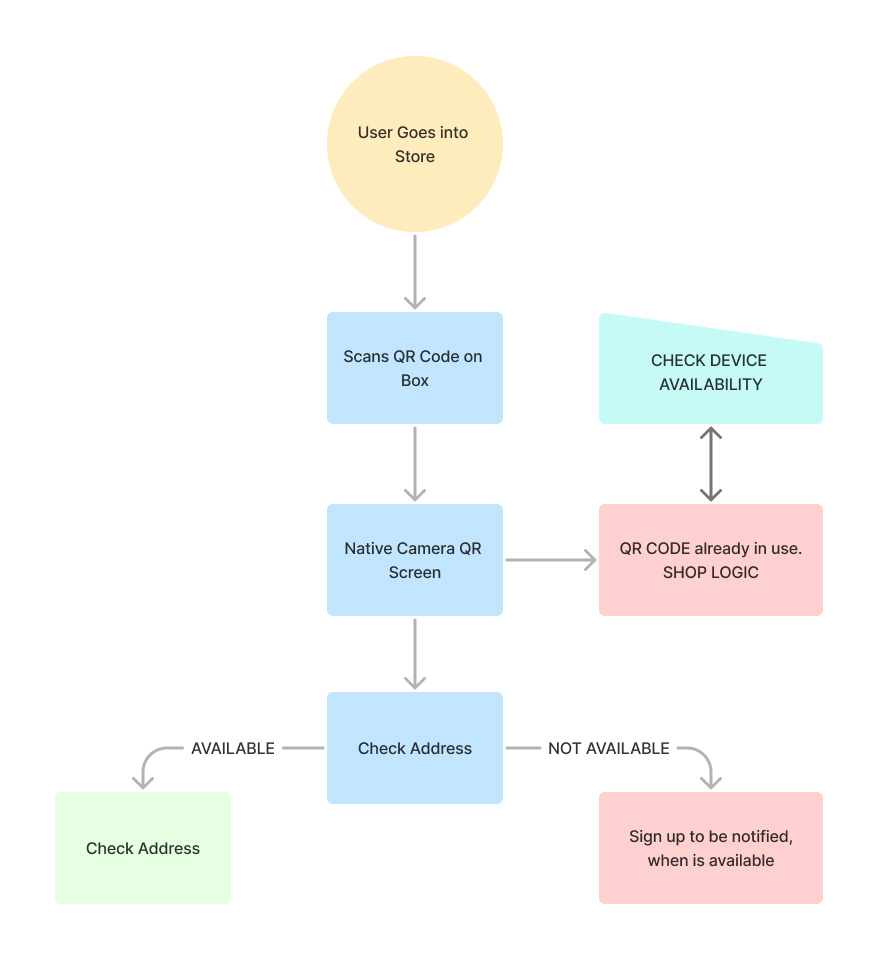
Simple flow map based on the business requirements. Storyboard
I created multiple storyboard flows that distilled research into relatable scenarios. These highlighted the most common tasks and failure points across the parking journey.
Updated User Journey Map
We mapped 8 core screens (Add Vehicle → Destination → Duration → Find Space → Space Details → Confirm Payment → Navigation → Active Session) to validate a strictly linear progression. Low-fidelity user tests proved this one-question-per-screen architecture reduced booking errors by 40%.
Wireframes
Created several key screens to align stakeholders on the MVP experience.
Medium-Fidelity Designs
Refined wireframes into mid-fi screens that eventually became a clickable prototype.
Happy Path Prototype